Design Tips
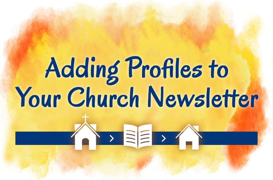
Adding Staff & Member Profiles to Your Church Newsletter
Featuring interesting profiles of church members, staff members, congregational leaders and volunteers helps people get acquainted or reacquainted with one another. Familiarity boosts communication and trust and encourages a family-like atmosphere throughout the church. The list of potential profile subjects is extensive. Adapt and add to this list, according to your congregation: senior and associate pastors youth…
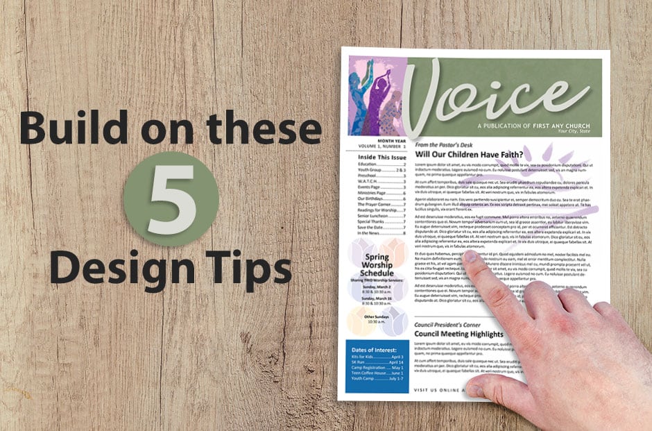
5 Design Ideas for Better Church Newsletters
“There is no such thing as no design,” writes author Adam Judge. “The alternative to good design is always bad design.” That raises the question: How can church newsletter editors ensure that their publications avoid falling into the “bad design” category? The answer involves understanding the basic elements of any newsletter design — and then using those elements in eye-pleasing…
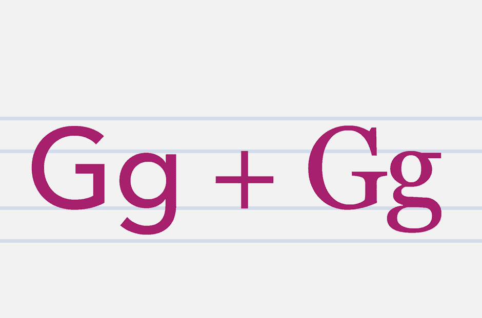
Tips for mixing and pairing fonts in your church newsletter
Whether you’re formatting a church newsletter, producing your weekly church bulletin, or designing a flyer for a church event, fonts play an important part in the overall design. We’re sure you have plenty of good content ideas. Try using some of these typography ideas to draw your congregation’s attention into that great content. But first,…

Design Challenge: Psalm 30:4
When designing Scripture Art, it’s always amazing to us how one bible verse can be illustrated in so many different ways. That’s why we thought it would be fun to do a little internal design challenge. The Challenge for our Artists We asked two graphic designers from the ChurchArt team to add their own personal…
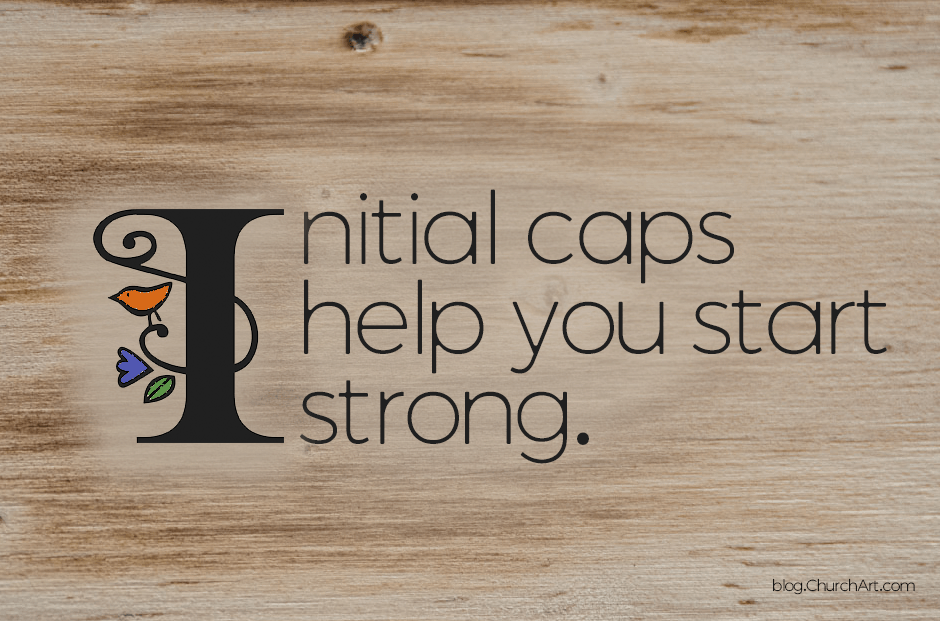
Start out strong with initial caps.
In design terminology, an oversized letter at the beginning of an article or paragraph is called an initial cap. These letters visually entice people to read the written word. They’re also a classy way to transition from a large, bold headline to an article’s light text. Types of initial caps There are 3 main types…
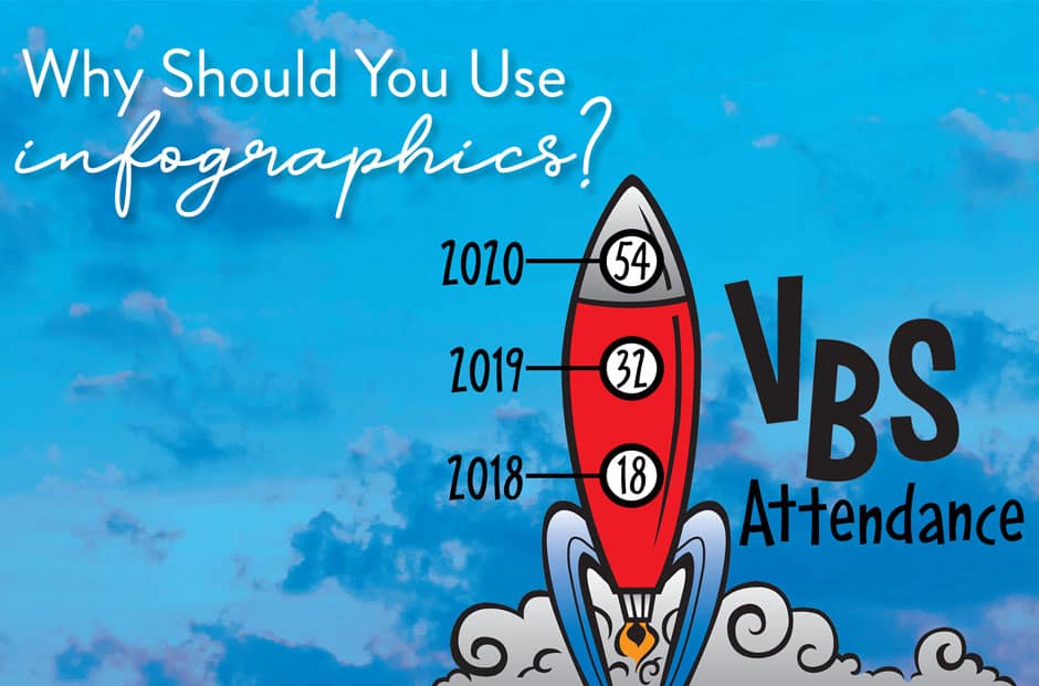
Use infographics for visual impact.
How can your publications present data about attendance, offerings, fundraising, budgets and more without overwhelming readers or quickly making their eyes glaze over? The solution is infographics! An infographic (or information graphic) is a visual representation of data or other information. They’re more than the plain old charts and graphs you remember from school. Infographics…
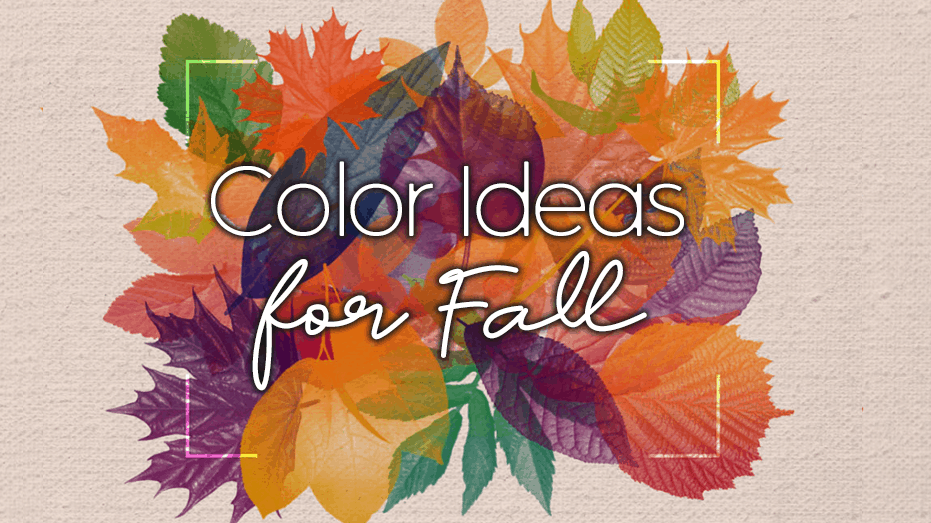
Spruce Up Your Color Palette for Fall
Here are some gorgeous colors to incorporate into your church publications this Fall.

Try these Trunk or Treat alternatives!
Because 2020 has been so “tricky,” traditional Trunk or Treat events may not be possible this fall. But if you still want to “treat” your church and community members with a special yet safe celebration, check out these amazing ideas some churches are using! Trunk or Treat alternatives: Below are just a few of the great…
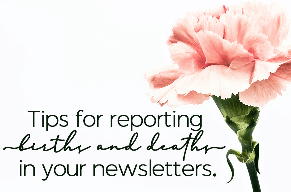
Tips for reporting births and deaths in your newsletters.
A frequent question we get at ChurchArt.com is “What are some tips for reporting births and deaths in my newsletter?” The main thing is to treat each birth and death as unique. So, if possible, avoid merely listing names and instead, compose a few sentences to make each announcement personal. Tips for Creating Birth and…
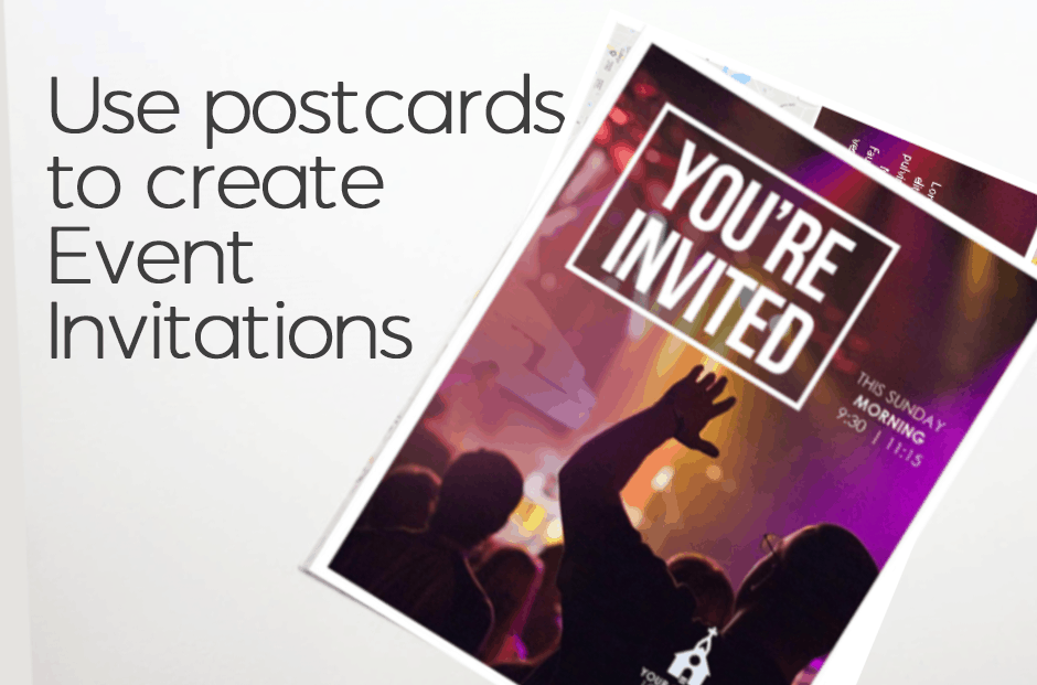
Use Postcards To Create Event Invitation
A well-attended event is a successful event. And, a key to good attendance is communication! Of course, you can always extend invitations by email, calls, or texts to get the word out, but having an invitation that shows up in one’s mail that serves as a physical reminder of the event is another excellent option.…
- « Previous
- 1
- 2
- 3
- Next »