ChurchArt Team
We love art, are passionate about helping churches create professional-looking communications and are a fun bunch of folks. With an in-tune creative director and a rock-solid team of artists, we will provide the art you’ll want to use, plus templates, puzzles and extras that make your job easier.

Vary Image Sizes To Guide Readers
A previous “Design Tips” introduced a newsletter remake, showing how the publication’s nameplate has progressed throughout the years. Another improvement our designer made involves varying the size of the artwork on the pages. When images are all about the same size, no visual clue tells readers which to look at first. But when artwork sizes…

Offer Quick Kudos to Church Members and Staff
Caption-editable clip-art provides an easy way to celebrate, congratulate and appreciate people. These bright ribbons, for example, let you call out and honor individuals or groups. Add text using your favorite program, such as Word, Publisher, Photoshop, etc., or use the ChurchArt Pro online Caption Editor: A few example ideas: Free Downloads: Black RibbonBlue RibbonOrange Ribbon
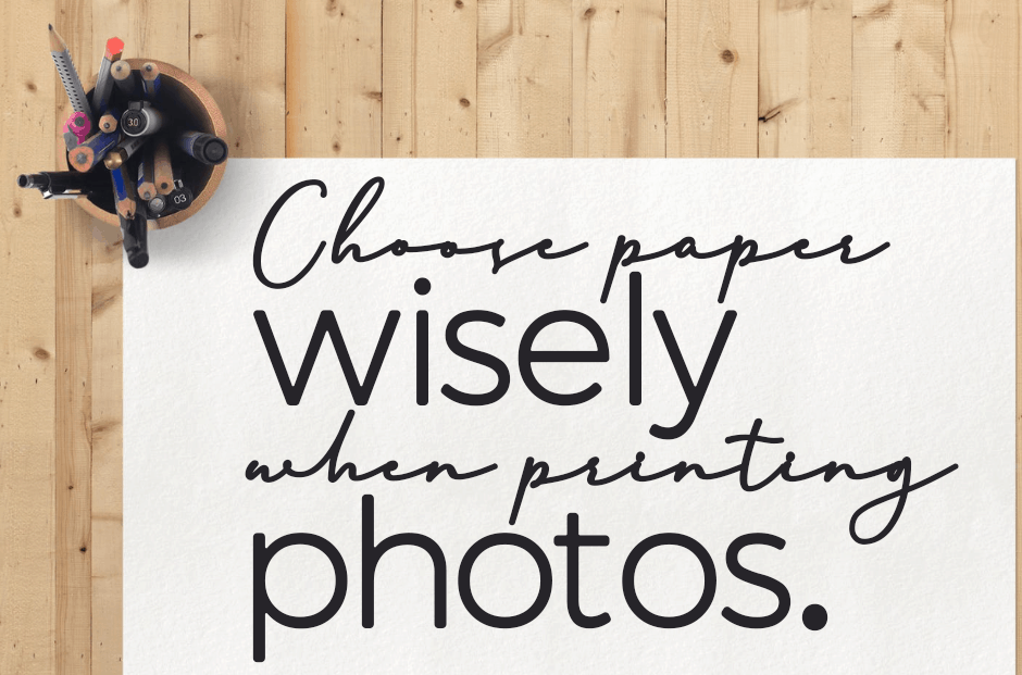
Choose paper wisely when printing photos
General, multi-use office stock works well for … multiple uses. It’s not the best choice for printing photos, however. Standard office stock has a matte (or uncoated) finish, while photos stand out better when reproduced on a glossy (or coated) finish. Paper quality is especially important when you’re printing photos on both sides of a…
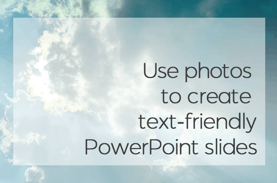
Use photos to create text-friendly PowerPoint slides
The online library at ChurchArt.com contains a wide variety of PowerPoint slides featuring transparent areas. That way text stands out, yet some of the image still shows through. These slides are ideal for worship services, meetings and presentations because they grab people’s attention and convey information in visually pleasing ways. To create your own text-friendly PowerPoint slide…
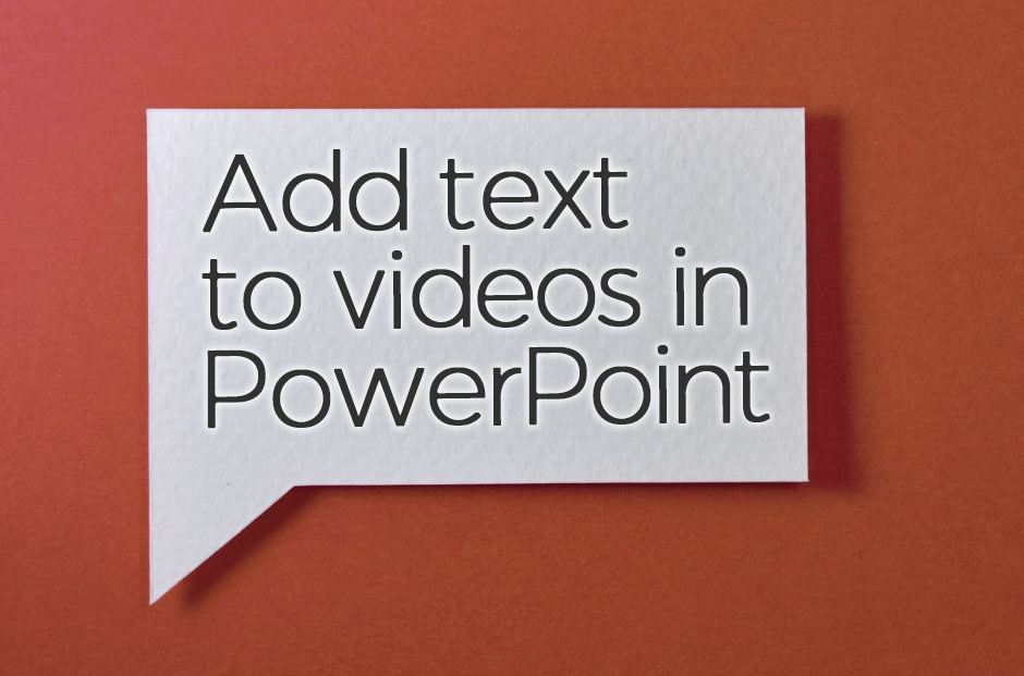
Add text to videos in PowerPoint
In a past post we explained how to add text to blank motion videos using video-editing software. You can easily add text to videos that are in a PowerPoint presentation. Here’s how: First, insert a video. From a blank slide, under Insert choose Video. Then under Insert choose Text Box and type the words. Format the font and colors as desired. If…
Q&A: Display your Church Mission Statement
Question: Do you have suggestions or samples for printing and framing my church’s mission and vision statements? Answer: Displaying these statements is a great idea! We’ve created two templates — formal-looking and contemporary — for that purpose. Choose the style that best fits your congregation. Then display the framed statements in the church office, fellowship hall or…

Q&A: Adding text to blank motion videos
Question: The motion videos on your site are very handy; can I change the text on them? Answer: Although you can’t make changes to videos that already contain text, you can add your own text or Scripture verses to our wide selection of blank videos. To do that, you’ll need video-editing software. Many computers come with Windows…
See how a nameplate improves over time
A newsletter editor at a South Carolina church requested ideas for freshening up the publication, which we redesigned more than 10 years ago. These front pages show how the newsletter’s “look” has progressed over time: For the latest remake, our designer began with the nameplate. That entire area is now much larger, with room for…

Give VBS attendees a special certificate
Looking for a fun, easy way to honor the children who attend your church’s vacation Bible school? Celebrate what kids learn this summer by presenting them with personalized Certificates of Participation. As a bonus, we’re providing a free template from Essential Church Certificates: Children’s Edition. Simply fill in the information, print and sign. Then watch children’s…
How To Unbox Your Boxed-in Text
When a layout is filled with boxes, the design has a “closed off” feel. But it’s easy to set your pages free! We addressed this in a previous “Design Tips” post called “Learn the proper use of boxes, screens and rule lines.“ Below, learn how to make an outlined text box less “boxy.” The unboxed…

