See how a nameplate improves over time
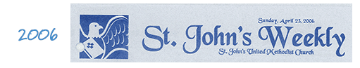
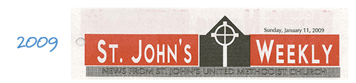
A newsletter editor at a South Carolina church requested ideas for freshening up the publication, which we redesigned more than 10 years ago. These front pages show how the newsletter’s “look” has progressed over time:

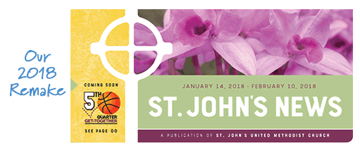
For the latest remake, our designer began with the nameplate. That entire area is now much larger, with room for a photo, and the newsletter name looks like more than just another headline. The enlarged cross symbol serves as a rule line, dividing sections of the nameplate, and news about an upcoming special event fits nicely to the left of the cross.
ChurchArt Team
We love art, are passionate about helping churches create professional-looking communications and are a fun bunch of folks. With an in-tune creative director and a rock-solid team of artists, we will provide the art you’ll want to use, plus templates, puzzles and extras that make your job easier.
Share This Post:
All the church-specific art you need IN ONE PLACE.