The ChurchArt Online Blog

Church News Bulletin Redesign Case Study
Church Bulletin Redesign scores a “win” for the weekly news bulletin! A subscriber in Texas asked for new ideas for her church’s weekly bulletin. Because “The Champions Spirit” is packed with information, it basically serves as a mini-newsletter each Sunday. The Nameplate To update the bulletin’s look, our designer first energized the nameplate. With an…
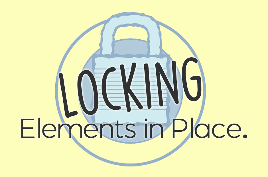
Freezing Or Locking Elements In Place
Have you ever had an image “jump” positions after you add or edit text in your document, only to have it move again the next time you edit? Annoying, right? Some programs — such as Word, Publisher and even Photoshop — give you an option to “lock” an element in place. This is especially helpful…

Use Grids And Frames To Showcase Images
Whether you’re showcasing pictures of the youth group, a recent bake sale or highlights from a mission trip, aligning images or using frames can present a more professional look. Although, let’s be honest: Adding any pictures of delicious desserts is sure to grab attention, no matter the layout!

Get Ready for VBS Season with these Free Form Template Download
For many of us, VBS planning is well underway. As you prepare for your Vacation Bible School (VBS), one thing you’ll need is a way to recruit volunteers and register children. Below are some easy to edit VBS forms, free to download! Volunteer Form Template SignUp Genius is an amazing online tool to schedule church volunteers…
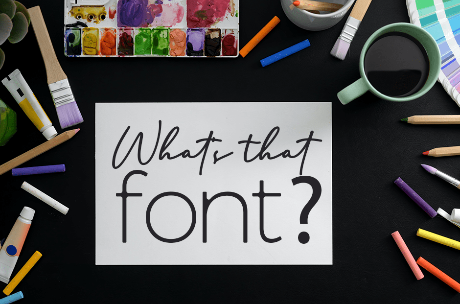
What’s that font?
These days, there’s no need to be stumped by a font’s identity. With all the resources now available, detective work is a snap. At www.myfonts.com/WhatTheFont/, for example, you can upload a PNG or JPG image for a quick search of 133,000 fonts. Highlight the line of text in question, and the website will find the…
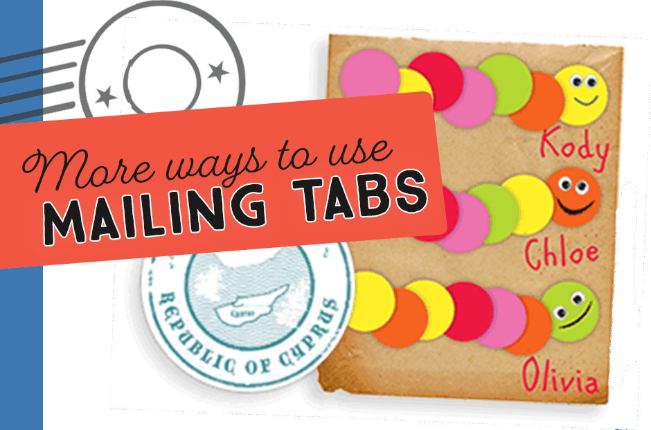
Mailing Tabs do more than just seal your mailings.
We all know that wafer seals and other mailing tabsare great for sealing and mailing your church’s newsletter. Not only do they comply with the United States Postal Service’s latest guidelines for postage automation, but these mailing tabs make distributing your paper newsletters easier, less expensive, and look more professional and attractive. But did you know that…

