Design Tips
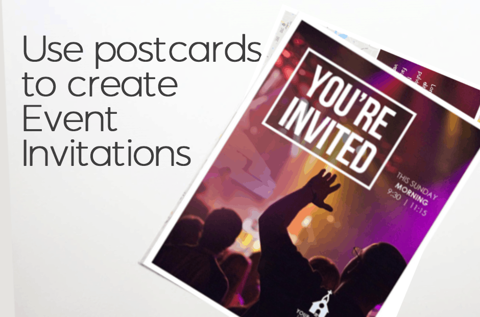
Use Postcards To Create Event Invitation
A well-attended event is a successful event. And, a key to good attendance is communication! Of course, you can always extend invitations by email, calls, or texts to get the word out, but having an invitation that shows up in one’s mail that serves as a physical reminder of the event is another excellent option.…
Vary Image Sizes To Guide Readers
A previous “Design Tips” introduced a newsletter remake, showing how the publication’s nameplate has progressed throughout the years. Another improvement our designer made involves varying the size of the artwork on the pages. When images are all about the same size, no visual clue tells readers which to look at first. But when artwork sizes…
Choose paper wisely when printing photos
General, multi-use office stock works well for … multiple uses. It’s not the best choice for printing photos, however. Standard office stock has a matte (or uncoated) finish, while photos stand out better when reproduced on a glossy (or coated) finish. Paper quality is especially important when you’re printing photos on both sides of a…
See how a nameplate improves over time
A newsletter editor at a South Carolina church requested ideas for freshening up the publication, which we redesigned more than 10 years ago. These front pages show how the newsletter’s “look” has progressed over time: For the latest remake, our designer began with the nameplate. That entire area is now much larger, with room for…
Q&A: Which font style belongs where?
Question: I’ve heard about serif and sans serif fonts. Is there a best place to use each style, and why? Answer: The little “hooks” extending from a letter’s main strokes are what distinguish serif fonts from sans serif fonts. “Sans” means without, so sans serif fonts don’t have those little hooks. Because serifs help with readability, serif…
- « Previous
- 1
- 2
- 3


