Q&A: Which font style belongs where?
Question: I’ve heard about serif and sans serif fonts. Is there a best place to use each style, and why?
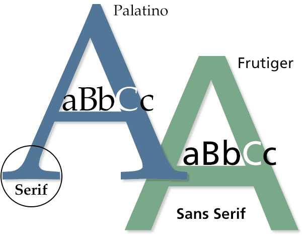
Answer: The little “hooks” extending from a letter’s main strokes are what distinguish serif fonts from sans serif fonts. “Sans” means without, so sans serif fonts don’t have those little hooks.
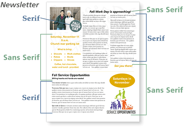
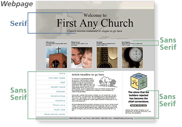
Because serifs help with readability, serif fonts are usually best for body copy in print. Sans serif fonts are best for headlines, often in bold. Sans serif fonts are also generally more effective for use on screens, such as websites and PowerPoint presentations.
No matter which fonts you choose, limit your use to two or three fonts per publication, and be consistent from page to page and from issue to issue.
ChurchArt Team
We love art, are passionate about helping churches create professional-looking communications and are a fun bunch of folks. With an in-tune creative director and a rock-solid team of artists, we will provide the art you’ll want to use, plus templates, puzzles and extras that make your job easier.
Share This Post:
All the church-specific art you need IN ONE PLACE.