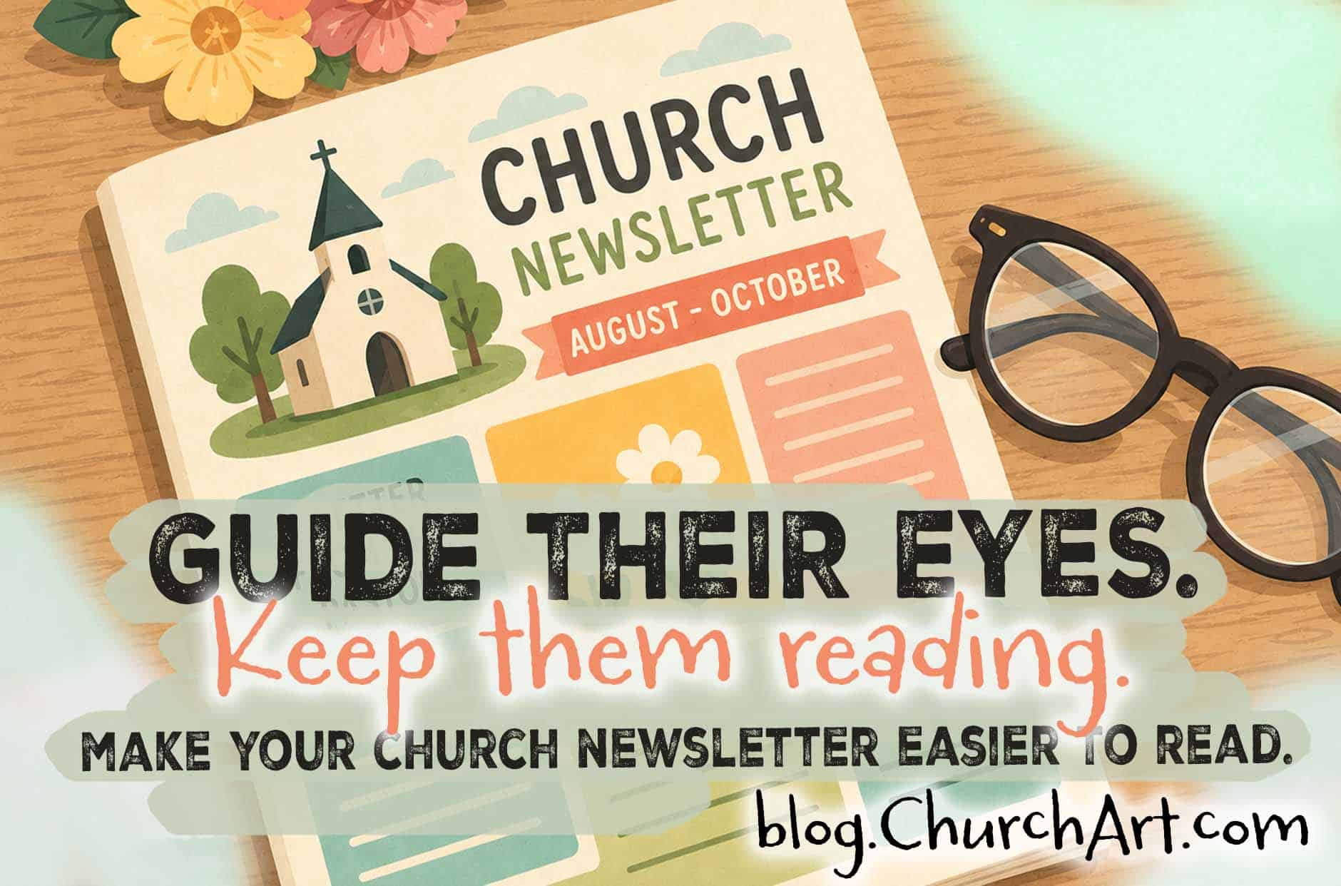
Improve Your Church Newsletter Layout by Guiding Readers’ Eyes
Your church newsletter layout is just as important as the content it contains. In fact, the layout determines how people interact with all that content—whether they’ll start reading it, and how much of it they’ll finish.
Readability doesn’t mean you need to fill your monthly newsletter publications with super-short blurbs or “dumb down” the content. With skillful newsletter image placement, even large blocks of copy become more reader friendly.
Artwork that guides the reader’s eye provides a map for traveling through the text. Instead of feeling intimidated by all the information in your newsletter or church bulletin, people will know where to start and how to proceed.
For a church newsletter that hooks readers at the beginning and holds their attention until the end, explore the helpful newsletter layout tips below. Consider your own publications and how you can use these simple steps to boost readability and readership.
Church Newsletter Layout Tips
To improve your church newsletter design, start using textual elements effectively.
Text-Based Tips
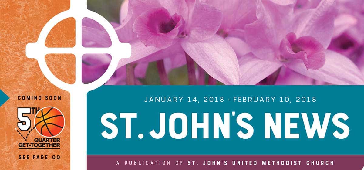
Begin with the church newsletter nameplate. This should walk a fine line between being attention-getting without being overwhelming. Use one main image that represents your congregation or ministry well. Then include the newsletter name, church name, and publication date. (Pro Tip: Save all the contact information for the masthead, and place that box on an inside page.)
Next, hook your church members with a well-crafted headline on page one. Snappy headlines announce, “This is important! Read this!” They also hold readers’ attention long enough to pull them into the copy. Without a headline, an article or column doesn’t issue an invitation for people to dive in and read. Aim to give every headline a subject and an action verb; otherwise, it will just seem to announce a topic rather than point them to last minute upcoming events or other important information.
Headings and subheads are another effective way to grab attention and guide readers through a longer newsletter article. These lines of prominent type mark the end of one subject and the beginning of the next. By breaking text into shorter, less daunting segments, subheads encourage readers to continue making their way through the material.
For especially long newsletter articles, provide regular eye relief for readers through pull-quotes or callouts. These are enlarged quotes from the article, often placed within a box or between rule lines, that highlight and repeat key statements. Pull-quotes also provide variety and a sense of importance, keeping readers interested in the material.
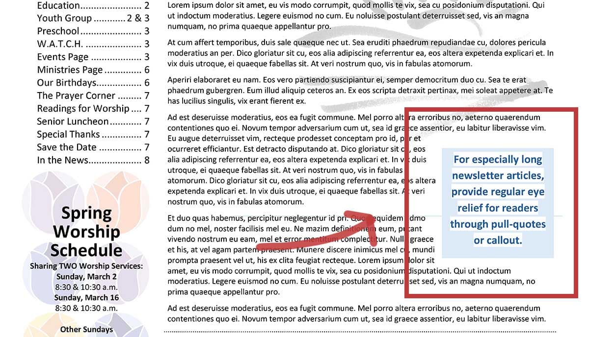
Image-Based Tips
Other readability tips involve graphic elements, using image size and other visual cues to guide readers.
Humans are naturally drawn to pictures more than words, and images help reduce the monotony of excessive print. Then after readers are invested in the article itself, graphics encourage them to continue to the end.
Don’t limit yourself to photos or clipart, though. All types of artwork — boxes, borders, frames, charts, rule lines, and cartoons — invite readers into the article and then guide them through the text.
An important note about church newsletter image sizes: When artwork on the same page is all about the same size, readers receive no visual cues about where to look first. Varying the sizes of artwork is a sure-fire way to guide people’s eyes, because they gravitate to the largest image first.
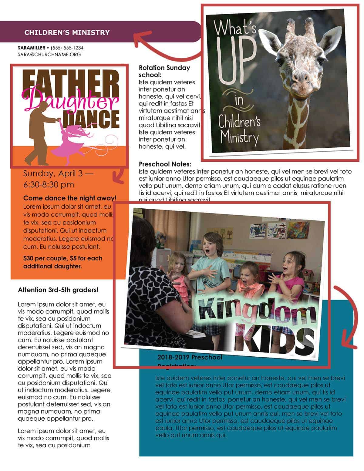
Visual hierarchy in newsletter design is called the theory of dominance. Graphic designers also call it the Goldilocks method, because the goal is to use one large image, one medium-sized image, and one smaller image on each page or layout.
Many image-based techniques can improve reader retention. For example, add color and gradients of color to attract people’s attention.
Contrast, font choice, and white space play important roles in how a member interacts with your church communication. Make sure the paper isn’t so dark that the ink blends into it. Keep fonts legible and consistent. And make sure all the items are separated by plenty of breathing room.
Also, use care when choosing the number of columns on each page. Columns that are either too narrow or too wide for comfortable reading tend to turn people away.
Entire pages of unbroken copy feel tedious to busy readers with tired eyes. Whenever possible, break up large blocks of text by adding space and graphic elements.
Images aren’t appropriate for every topic, of course, and you should always use them with restraint.
Respect Your Readers
When preparing any publication, ask how you can make the reading process easier. Keep your audience in mind, remembering that many of them are likely multitasking or short on time.
After putting so much time and effort into each congregational newsletter and church bulletin, you want to make sure people engage with it. So take these simple extra steps to draw in your audience and communicate information effectively.
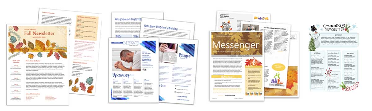
With strong headlines, visual relief, and different-sized graphics, your layouts will reel in readers and keep them in the know.
Want a head start on improving your church newsletter layout? Start a 14-day free trial of ChurchArt Online to download ready-to-use newsletter templates and customize them for your church.
Stephanie Martin
Stephanie Martin is a senior editor at Communication Resources, producing monthly issues of The Newsletter Newsletter and ChurchArt Online. For more than three decades, she has written and edited materials for Christian congregations and ministry leaders. At her Denver-area church, Stephanie has volunteered in a variety of areas, from Sunday school and VBS to finances and administration.
Share This Post:

All the church-specific art you need IN ONE PLACE.