The ChurchArt Online Blog
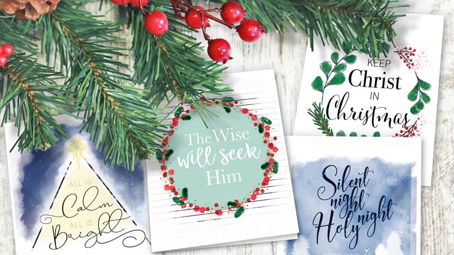
FREE Cards to Share Christmas Joy
With apologies to a certain famous reindeer, Christmas 2020 certainly will “go down in history.” The pandemic might be taking a toll on some beloved seasonal events and traditions, but one is sure to be more meaningful and appreciated than ever this year: sending Christmas cards to celebrate the good news of Jesus’ birth. Because…
Spruce Up Your Color Palette for Fall
Here are some gorgeous colors to incorporate into your church publications this Fall.
Try these Trunk or Treat alternatives!
Because 2020 has been so “tricky,” traditional Trunk or Treat events may not be possible this fall. But if you still want to “treat” your church and community members with a special yet safe celebration, check out these amazing ideas some churches are using! Trunk or Treat alternatives: Below are just a few of the great…
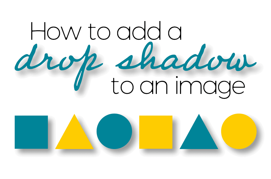
How to add a drop shadow to an image.
Graphic designers often use drop shadows as a simple visual effect. It gives an image dimension by making the object appear to lift off the surface of the background. A drop shadow is essentially a gray or black (or sometimes color) version of an object’s shape. It’s placed behind the object and its position is…
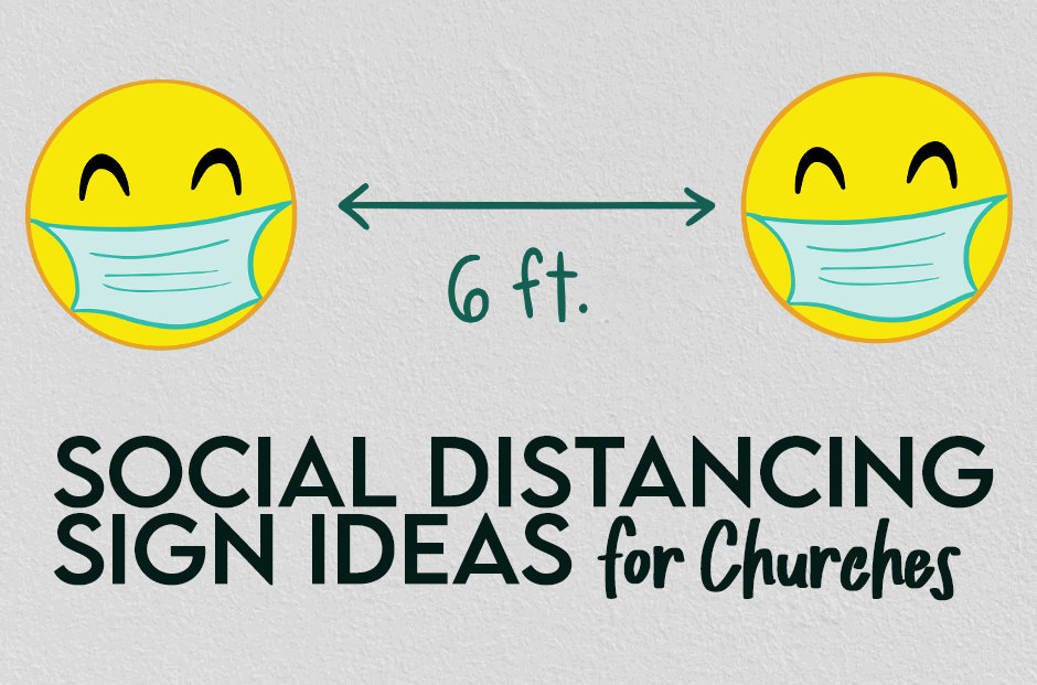
Church sign ideas for social distancing
As churches make decisions about gathering again in buildings, safety and communication are key. Worshipers need to be informed about protocols and policies, but you can do that in a friendly way with signs and artwork. However, you may be looking for something that is a bit more friendly for your church congregation when it…
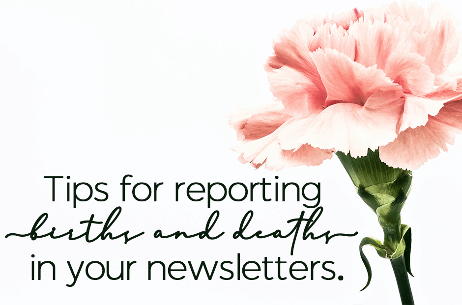
Tips for reporting births and deaths in your newsletters.
A frequent question we get at ChurchArt.com is “What are some tips for reporting births and deaths in my newsletter?” The main thing is to treat each birth and death as unique. So, if possible, avoid merely listing names and instead, compose a few sentences to make each announcement personal. Tips for Creating Birth and…

