Church News Bulletin Redesign Case Study
Church Bulletin Redesign scores a “win” for the weekly news bulletin!
A subscriber in Texas asked for new ideas for her church’s weekly bulletin. Because “The Champions Spirit” is packed with information, it basically serves as a mini-newsletter each Sunday.
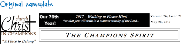
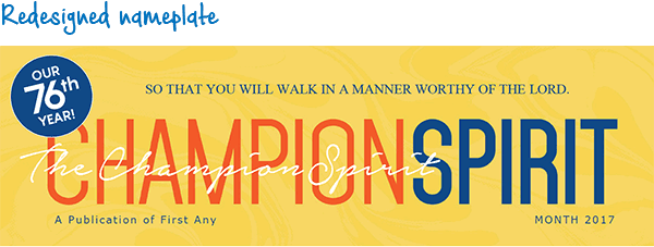
The Nameplate
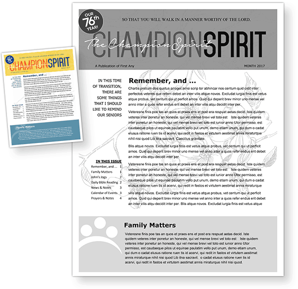
To update the bulletin’s look, our designer first energized the nameplate. With an enlarged space, bright colors, less clutter and implied movement (thanks to a background design and the name repeated in white cursive font), the bulletin now has a vibrant, clear identity that grabs readers’ attention.
The Interior Page Update
In addition to creating a new nameplate for page one, we redesigned interior pages to reduce the use of boxes and heavy black rule lines.
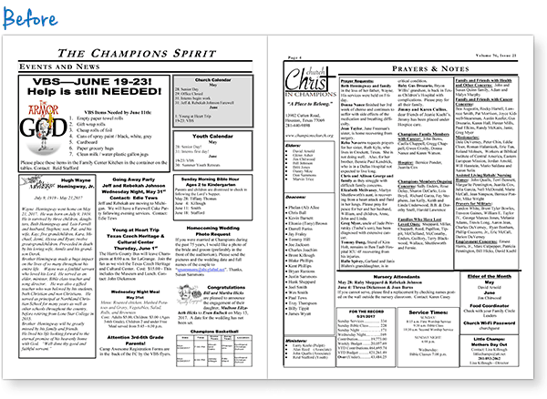
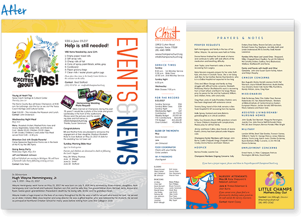
Adding color, shading and a few thinner rule lines keeps the news items separated while opening up the pages. A less-boxy appearance is more inviting to readers and encourages them to read all the material.
New, Modern-Looking Fonts and Typography
Another improvement is the use of more modern-looking fonts.
Instead of relying heavily on Times New Roman, the redesign features sans serif fonts such as Pangram for the majority of text and Trajan in a few spots. Mohave is in the nameplate, as well as in-text running up the side of the inside pages.
Note that the Word template we provide, in order to be editable, uses fonts that come with Word (Arial, Tahoma, Verdana). Fonts used in the redesign are available at various websites, often for free.
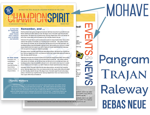
Other modern, easy-to-read fonts we recommend include Raleway, Avenir and Bebas Neue (all sans serif). Modern-looking serif options include Legacy, Questa, and Berkeley.
Black And White Option for Easy Printing
Although the bulletin redesign featured in this post is shown in color, it also looks great in black and white. If you can’t print in color, you still can make improvements to your church publications.
For the black-and-white version of this redesigned bulletin, we made all the text black. (That’s usually best, unless there’s a good reason for some to be gray.) An exception is in the nameplate, where white and gray display fonts simulate color. The yellow and blue boxes from the color version of the template are now rendered in shades of gray.
Clip-art can be shown as either black-and-white line art or grayscale, depending on the desired effect. Art can also be white on a gray background, such as in the Family Matters box. Experiment a bit to see what looks best.
Free Church Bulletin Template Download
Microsoft Word and Publisher templates for this redesigned publication are available for you to download and use. The download below includes the color and black and white template files:
Download WORD template
Download PUBLISHER template
ChurchArt Team
We love art, are passionate about helping churches create professional-looking communications and are a fun bunch of folks. With an in-tune creative director and a rock-solid team of artists, we will provide the art you’ll want to use, plus templates, puzzles and extras that make your job easier.
Share This Post:
All the church-specific art you need IN ONE PLACE.