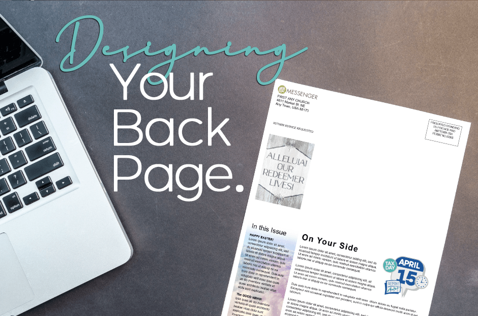
Designing a newsletter’s back page
The front page and back page of your church newsletter are prime real estate because those are the pages that most people see first. In magazines, the back cover is often the most expensive ad space.

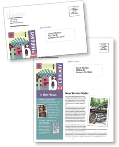
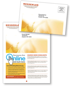
The back pages of many newsletters have a mailing panel on the top half and other information on the bottom. The newsletter is then folded to create the mailing panel on one side (which functions as the front page for postal workers).
The other side is optimum space for important information. Even when the newsletter is laid down unopened, there’s still a 50-50 chance that the back cover will land face up and be seen.
Because of the high visibility of this area, we suggest you use it for:

- Important news item(s)
- Cancellation notices
- Last minute news
- Table of contents or “What’s Inside” teasers
- Important dates and events
- Worship schedules, especially during the Christmas and Easter seasons when you’re likely to have additional worship services
- Appealing photos of people that relate to an accompanying announcement
- Other information you want all members to see, even if they never open the newsletter.
- The church’s website address
- Seasonal artwork, such as a graphic illustrating the month or a holiday frame to enclose the panel
Two things to keep in mind:
First, if you want people to pay attention to what’s on this space, don’t overfill it. Otherwise nothing will stand out. A single item with plenty of white space surrounding it draws more attention than having several elements.
Second, avoid putting personal information — such as names of ill members, prayer requests, home contact information for committee chairs, similar private and personal data or financial statistics — in this area. Until the newsletter reaches recipients’ homes, this is public space.
Remember, while the back page may seem insignificant, it isn’t. So, don’t treat it as an afterthought — put plenty of thought into how to use the space wisely.
Try ChurchArt.com, FREE for 14 days!
To make the most of your church newsletter and engage your community even further, consider exploring the wealth of resources available with our free 14-day trial at ChurchArt.com. This trial gives you access to an extensive collection of ideas, templates, and designs specifically tailored for church newsletters and other communications. Whether you’re looking to refresh your newsletter’s look, find inspiration for your next issue, or discover new ways to connect with your congregation, our trial offers everything you need to elevate your church’s messaging. Sign up today to start exploring, and see how our tools can help you make every page of your newsletter more impactful and engaging. Don’t miss this opportunity to enhance your church’s communication with professional, faith-inspired artwork and content.
ChurchArt Team
We love art, are passionate about helping churches create professional-looking communications and are a fun bunch of folks. With an in-tune creative director and a rock-solid team of artists, we will provide the art you’ll want to use, plus templates, puzzles and extras that make your job easier.


