How to Create Effective Sermon Presentation Slides for Your Church
PowerPoint slides are no longer relegated to boardrooms and classrooms. Thanks to easy-to-use technology and the proliferation of screens, presentation slides have become valuable worship aids in many churches. Pastors and Christian education leaders use PowerPoint slides to display pre-service announcements, hymn lyrics, sermon notes, prayers, portions of the liturgy, communion distribution instructions, Bible study key points and much more.
Presentation slides allow people to easily follow along and engage with the material. When used well, worship sermon slides or sermon backgrounds also grab and hold worshipers’ attention. With slide presentations, no one will ever get lost!
As a bonus, by using PowerPoint slides your church may be able to cut down on paper usage and printing costs. Although some people still prefer to have printed copies of the order of service, many worshipers have grown accustomed to following along on screens. Younger people tend to especially enjoy visual aids and multimedia options at church. But older people will adapt quickly too — and many will appreciate not having to hold up heavy hymnals and flip back to forth to the correct location.
If you’re new to creating sermon presentation slides of backgrounds — or simply want to maximize their effectiveness — check out the important tips below. With a bit of planning and know-how, you and your church staff can keep people informed while enhancing their worship and learning experiences.
4 Keys to Top-Notch Sermon Presentation Slides
PowerPoint slides should add to, not distract from, church services and gatherings. So, make sure these visual helps for creating nice backgrounds don’t unintentionally turn into hindrances!
Follow this easy advice to convey messages in a clear, succinct, and professional manner.
1. Make presentation slides as simple as possible.
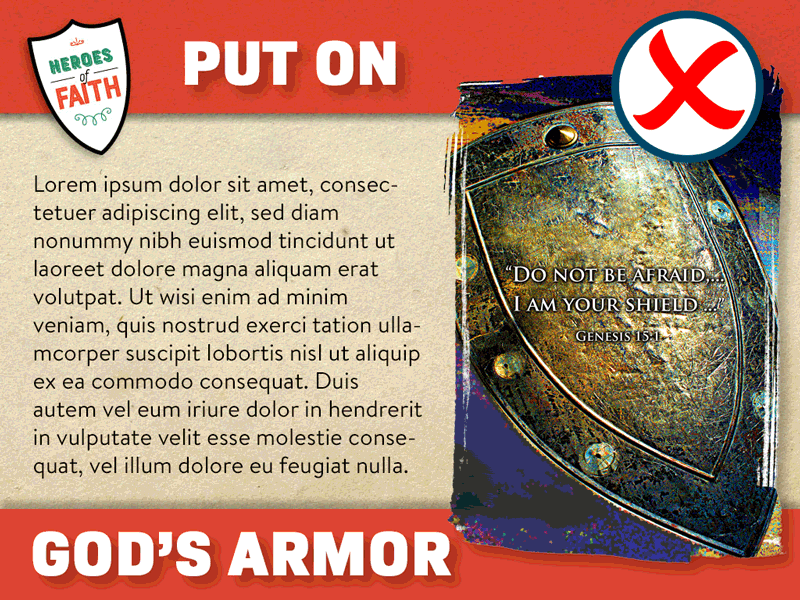
For sermon slides, less is always more. By keeping slides simple, you draw in the congregation’s eyes and help people focus on your main points. Cluttered presentation slides appear jumbled, with excess visual clutter that’s tough to wade through.
Minimize not only the content on each slide but also the background appearance, colors, fonts, animation and images. Avoid over-styling with fancy flourishes. Instead, keep the font large. After all, sermon PowerPoint presentations backfire if they’re too small to read from a distance! Therefore, test your slides ahead of time by viewing them from the back pew or from the back of a class meeting area.
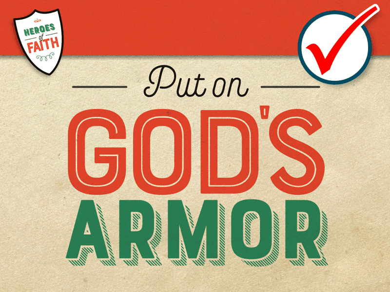
2. Leave plenty of white (or unfilled) space.

Keeping sermon presentation slides simple means avoiding the temptation to cram them with text. By overfilling slides, you end up bombarding people with information — if they can even read the material in the first place.
The goal of sermon slides should be to reinforce main ideas, not provide complete thoughts. Avoid using full sentences, except when quoting or presenting Scripture. For larger Bible passages, break them down into one readable chunk per slide.

3. Promote “flow” throughout the slide presentation.
For maximum effect, the flow of a set of sermon slides should follow the preacher’s message. Logical, step-by-step progressions make it easier for church members to understand and easier for your AV or media team to implement. (Remember to have these folks practice ahead of time to avoid glitches.)
One example of a naturally flowing slide presentation is a five-point takeaway from the day’s Bible reading. By featuring one point or keyword per slide, the pastor or teacher simplifies notetaking and facilitates learning.
4. Incorporate matching graphics.
Yes, we keep emphasizing that sermon presentation slides should be “simple.” Yet that doesn’t mean they need to be plain! Loads of attractive background slides and graphics are available in the ChurchArt.com online library. Free with your subscription, these images can be searched by topic, keyword or Scripture reference. It’s a snap to find what you need!
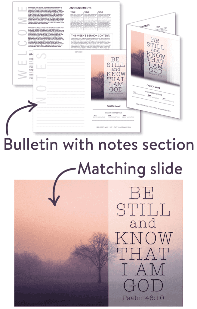
To boost the messages on your sermon slides, pair them with matching graphics in the worship bulletin and other materials. Coordinating images help tie together all the resources you provide for the congregation. In fact, a bulletin sidebar or insert can include the sermon’s main points — the same points you display on screen.
PRO TIP: Also insert room in the bulletin for worshipers to take sermon notes, if desired. This is a great way to keep everyone — especially children and youth — engaged with the day’s message and lessons.
One more note about graphics: Don’t be afraid to repeat imagery in your slide presentation. In fact, repetition serves to reinforce key points. For example, it’s fine to repeat a background throughout an entire multi-week sermon series. Although you may not want to do this every Sunday, it works especially well for special church seasons (such as Easter and Christmas) and for ongoing efforts (such as a stewardship campaign).
Now that you know the ins and outs of effective sermon presentation slides, enjoy putting together visual masterpieces for your church’s next worship service or Bible study!
ChurchArt Team
We love art, are passionate about helping churches create professional-looking communications and are a fun bunch of folks. With an in-tune creative director and a rock-solid team of artists, we will provide the art you’ll want to use, plus templates, puzzles and extras that make your job easier.


