
How To Unbox Your Boxed-in Text
When a layout is filled with boxes, the design has a “closed off” feel. But it’s easy to set your pages free!
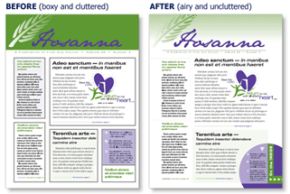
We addressed this in a previous “Design Tips” post called “Learn the proper use of boxes, screens and rule lines.“
Below, learn how to make an outlined text box less “boxy.” The unboxed newsletter template shown here is available to download and use. These instructions are for Microsoft Publisher, but we’ve added a few notes for Word users.
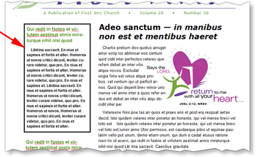
1: Choose a text box (or shape) for which you’d like to change the borders.
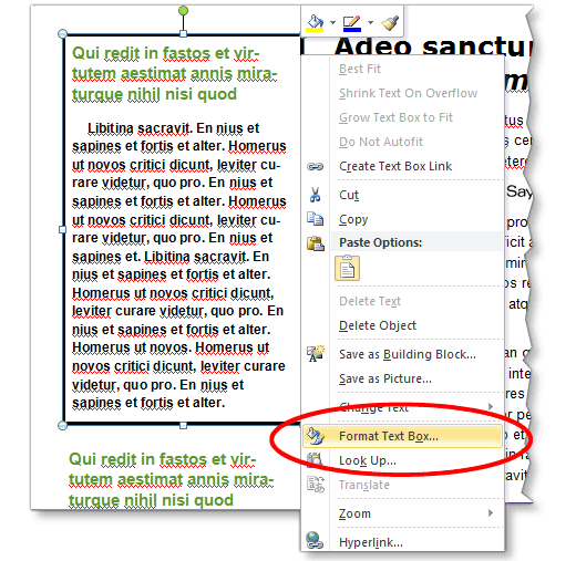
2: Right-click on the text box and choose “Format Text Box.”
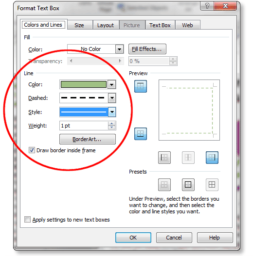
3: Under the “Colors and Lines” tab, by “Preview,” click on the portion(s) of the text box you’d like to remove or add a border to. You can choose the top, bottom or each side individually. On our template, we replaced a full black border with a lightly colored, dashed border on the top, bottom and right.
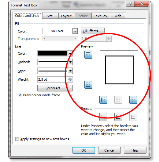
4: By “Line,” choose a color, style and weight. We suggest lighter colors and thinner lines. When adding a border to a black-and-white publication, choose a shade of gray rather than black.
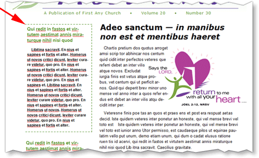
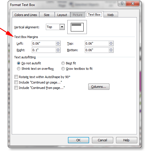
6: Under the “Text Box” tab, adjust the margins so text isn’t too close to the edges of the text box.
Note that Microsoft Word automatically puts a box around a text box. Remove it by right-clicking on the text box and choosing “Format Text Box.” Although you won’t have as many options as with Publisher, you can remove the box or change the line’s color, weight or style. If you feel the need to keep a box, make the border lighter and thinner.
A template of this newsletter is available in both Word and Publisher formats. Use these links to download Free the template for your own use:
ChurchArt Team
We love art, are passionate about helping churches create professional-looking communications and are a fun bunch of folks. With an in-tune creative director and a rock-solid team of artists, we will provide the art you’ll want to use, plus templates, puzzles and extras that make your job easier.


