Embracing the Season: Winter Color Palette Ideas for Church Newsletters
As winter unfolds, church members gather to share warmth, faith, and community. It’s a season filled with deep, reflective colors and soft, inviting hues that can beautifully transform church newsletters, worship slides, and bulletins.
Choosing the right color palette for your church’s winter newsletters, bulletins, and worship slides is not just about aesthetics—it’s about conveying emotion, meaning, and connection to your church members. These color inspirations offer a range of options to help you communicate effectively, resonate with the spiritual tones of the season, and keep your congregation engaged and inspired.
Here are some inspirational winter color palette ideas that can help you convey the serene beauty of the season while engaging your congregation. As you design your church communications this winter, let these colors guide you in creating materials that reflect the beauty and spirit of the season.

1. Classic Winter Whites and Blues
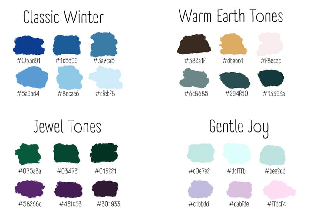
Nothing says winter like the classic combination of crisp white and icy blue. This palette evokes the purity of fresh snow and the biting chill of frosty air—perfect for conveying a sense of peace and tranquility in your church communications. Use a soft white background to bring a sense of calm and overlay it with different shades of blue for headers and key texts to add depth and interest. This color scheme works wonderfully for Advent bulletins or newsletters focusing on the theme of peace.
2. Warm Earth Tones
To add a cozy feel to your church bulletins and slides, consider a palette of warm earth tones. Rich browns, muted oranges, and soft tans can create a welcoming and comforting atmosphere. These colors mirror the natural decay of leaves and the earthy tones of bare trees, reflecting the season’s natural palette. Earth tones are excellent for church newsletters that want to emphasize community and warmth, making every church member feel like they’re receiving a warm, heartfelt hug through your content.
3. Jewel Tones for Liturgical Richness
Jewel tones like deep purple, royal blue, and emerald green bring a touch of sophistication and regality to church communications. These colors are not only visually striking but also carry liturgical significance. Purple, a color often associated with both Advent and Lent, represents penitence and preparation and can be used effectively in worship slides that call for reflection and prayer. Green, symbolizing growth and renewal, is ideal for newsletters that talk about new beginnings and the hope that comes with the birth of Christ.
4. Soft Pastels for a Touch of Gentle Joy
Soft pastels such as pale pink, lavender, and sky blue can bring a touch of gentleness to your church’s visual communications. These colors can be particularly effective for events centered around the community, such as church fundraisers or children’s services. They provide a gentle backdrop that makes your content feel light and airy, suitable for messages that aim to uplift and brighten the days of church members during the dark winter months.

5. Contrasting Blacks and Grays for Modern Elegance
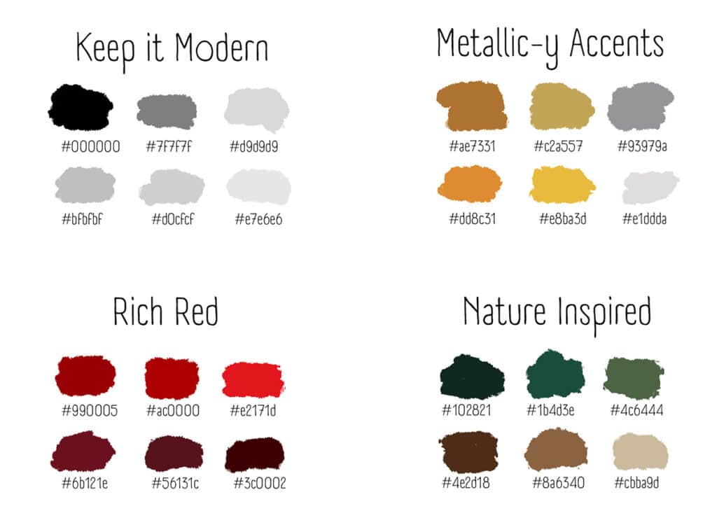
Consider using a palette of black, white, and gray for a more modern look. This combination can give your church newsletters and bulletins a sleek, contemporary feel. Black offers a powerful contrast to the typically soft and muted winter colors, making any color inspiration you choose to accent with it stand out dramatically. Use gray for text to ensure readability and reserve black for highlighting important sections or announcements.
6. Metallic Accents for a Festive Sparkle
Adding metallic colors like gold, silver, or bronze can bring a festive sparkle to your church newsletters, especially during the Christmas season. Gold represents celebration and is often associated with the joy of the nativity. Silver can add a sleek, modern touch to your layouts, reflecting the crispness of the winter season. Use these accents sparingly to enhance headlines or key graphics without overwhelming the overall design.
7. Rich Reds to Invoke Warmth and Tradition
Red is a color deeply embedded in winter traditions. It evokes warmth, love, and festivity and can be very effective in church bulletins around Christmas to energize and attract attention. Pair deep reds with gold for a traditional look, or with black for a more modern and bold approach. This color is perfect for inspiring joy and celebration among your church members during holiday services and events.
8. Nature-Inspired Greens and Browns
Finally, don’t overlook the natural palette of winter’s evergreens and the rich, damp soil they spring from. Dark greens paired with browns can convey a sense of life and endurance through the colder months. This palette is ideal for newsletters that focus on themes of enduring faith and steadfastness, reminding church members of the ever-present support and strength found in their community and faith.
By embracing these color palette ideas, you’ll beautify your church communications and enhance the sense of unity and festivity among your congregation. Whether you opt for the tranquility of winter whites or the festive sparkle of metallic accents, your choice in colors can profoundly impact the ambiance of your church’s winter activities.
Discover More at ChurchArt.com
Ready to bring these color inspirations to life in your church newsletters and bulletins? Become a member of ChurchArt.com today and gain access to an extensive library of newsletter graphics and templates designed specifically for church communications. Join our community and find everything you need to create stunning, inspirational materials that resonate with your congregation throughout the winter season and beyond.
ChurchArt Team
We love art, are passionate about helping churches create professional-looking communications and are a fun bunch of folks. With an in-tune creative director and a rock-solid team of artists, we will provide the art you’ll want to use, plus templates, puzzles and extras that make your job easier.


