
Tips for mixing and pairing fonts in your church newsletter
Whether you’re formatting a church newsletter, producing your weekly church bulletin, or designing a flyer for a church event, fonts play an important part in the overall design.
We’re sure you have plenty of good content ideas. Try using some of these typography ideas to draw your congregation’s attention into that great content.
But first, just what is a font? Is it the same as a typeface?
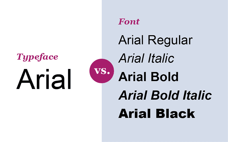
In today’s world, we often use font and typeface interchangeably. There’s actually a minor difference between the two.
Font refers to the specific weight, width and style within a font family. Typeface is another word for font family.
For example, Arial is a typeface because it has various fonts. Arial Black, Arial Narrow, Arial Rounded and Arial Regular are the fonts within the typeface or font family.
Sans-serif and serif
The fonts you choose influence how readers perceive your design and your message. Readability is of the utmost importance. Choosing the correct font for its purpose is a great place to start.
For church newsletters and church bulletins, select a font for the body copy first, because it’s used for the most content. For flyers, posters and web ads that advertise a church event, choose a headline font first, because you want it to grab readers’ attention.
Limit the number of fonts in church newsletters and church bulletins to only two or three: a headline font, a font for body copy and perhaps a third font for callouts or pull-quotes.
In general, use a sans-serif font for headlines and serif fonts for body copy.
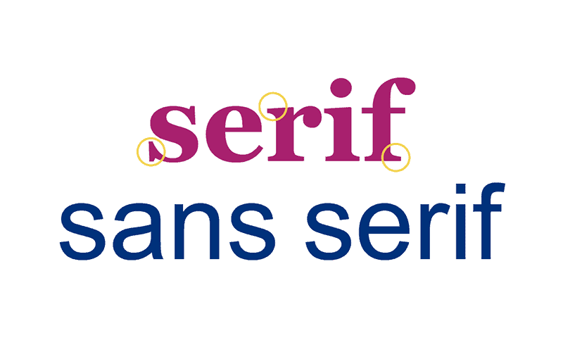
Serif typefaces improve readability, because the serifs — the “hooks” or “feet” on the ends of the main strokes of letters — lead the reader’s eye from one word to the next. That makes them suitable for large sections of text.
Sans-serif (without serifs) fonts don’t work as well as serif fonts for body text. Sans-serif faces are more effective when used with short amounts of text, such as headlines, subheads, captions and sidebars.
Mixing fonts in your church newsletter
The pairing of different fonts or different typefaces adds visual interest to any church publication or project. Check out these great examples of font combinations you can try!
Use two fonts from the same typeface. Even though the three words below use fonts from the same family, they look markedly different. The first is lowercase in a regular body weight, while the other sample uses upper- and lowercase and is set in black (sometimes called extra bold):
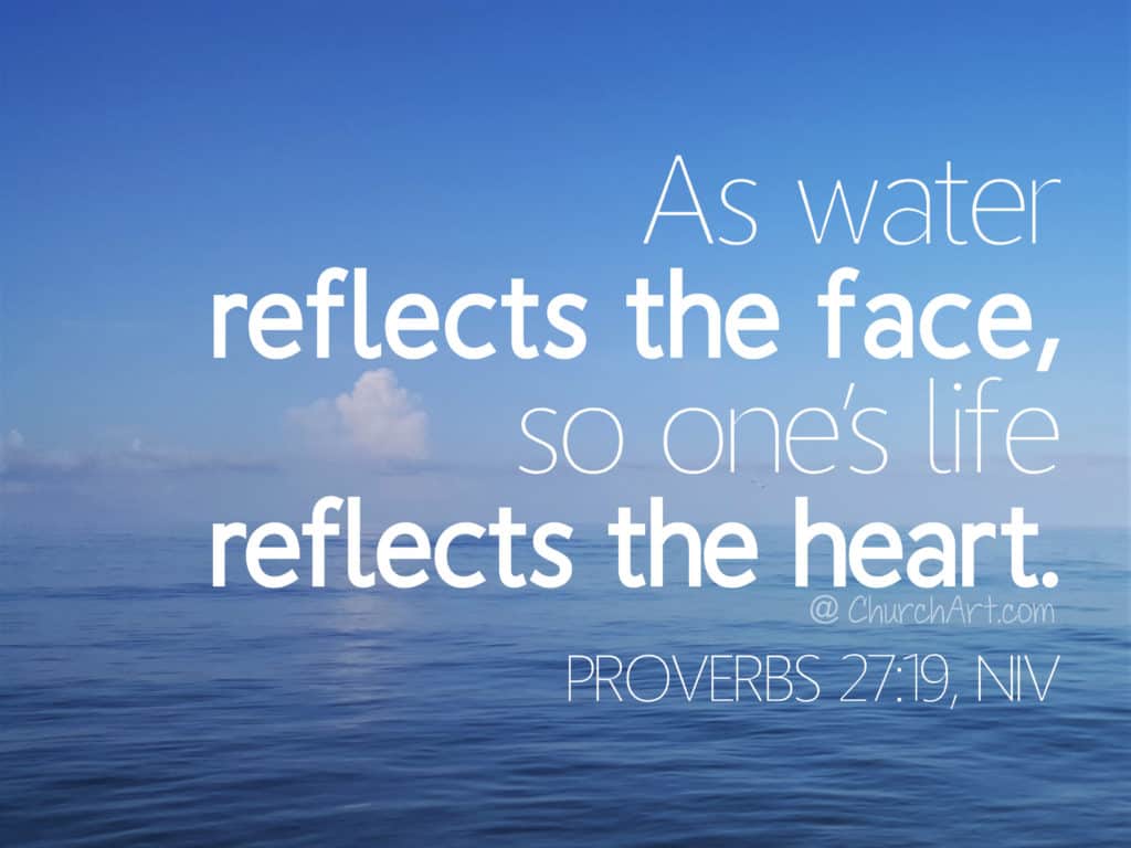
Experiment with contrasting fonts (such as serif with sans-serif or with script). In this example, the fonts differ but complement each other. The use of black letters and white letters also add contrast.

Or add contrast with a non-script font and a script font. These two samples are very different yet work well together. The combination attracts attention and adds interest for the reader. Using such a technique works well for callouts in church newsletters or for headlines on flyers and web ads:

Pair a bold ALL-CAPS font with a fun lowercase script font. This pair is like the sans-serif and script combination above, except now the sans-serif font is the bolder of the pair. The script font here is also more whimsical than the script font above:
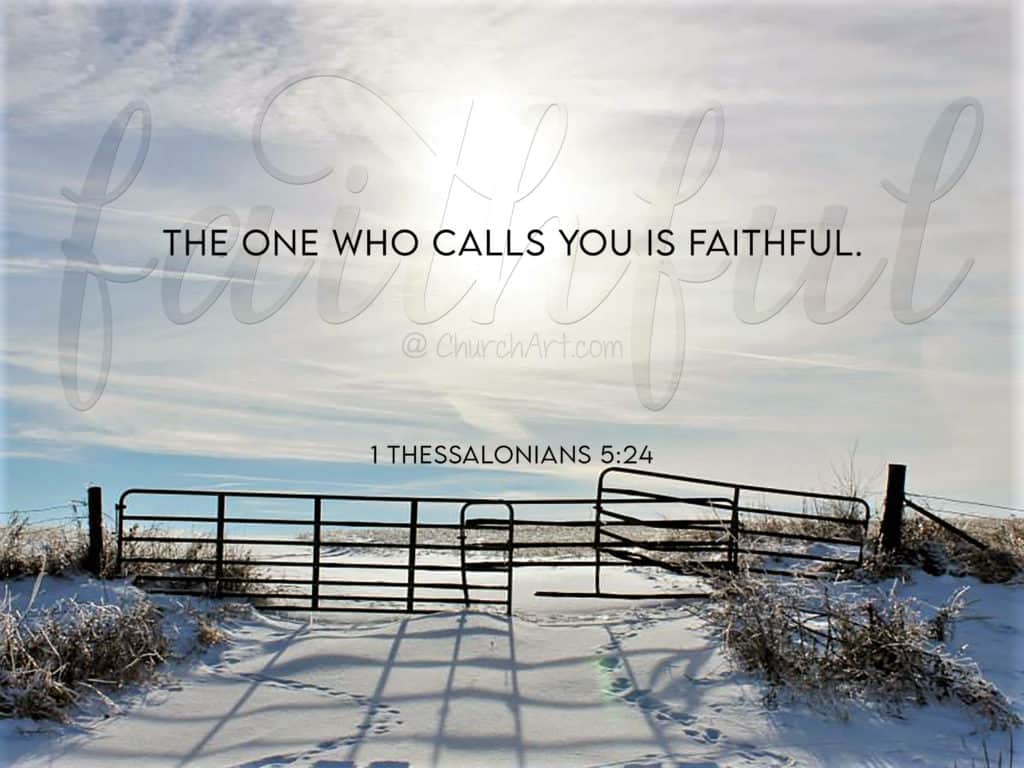
Try matching something elegant with something informal. These two fonts are extremely different from each other — a casual handwriting font combined with a stylized serif font:

When choosing fonts for a church newsletter, avoid pairing fonts that look too similar. Find fonts that complement each other but don’t compete.
More typography ideas for your church newsletter
Use these tips from our in-house graphic designer to elevate the typography in your church newsletter:
Using a script font is a good option for Scripture quotations. Use a smaller font size — either serif or sans-serif — for the Bible reference. This combination of typefaces gives the Bible verse the dignity it deserves.
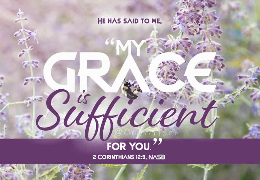
A casual script font used for only the first few words of an article piques the interest of your congregation. They’re likely to continue reading that first paragraph and, perhaps, the entire article.
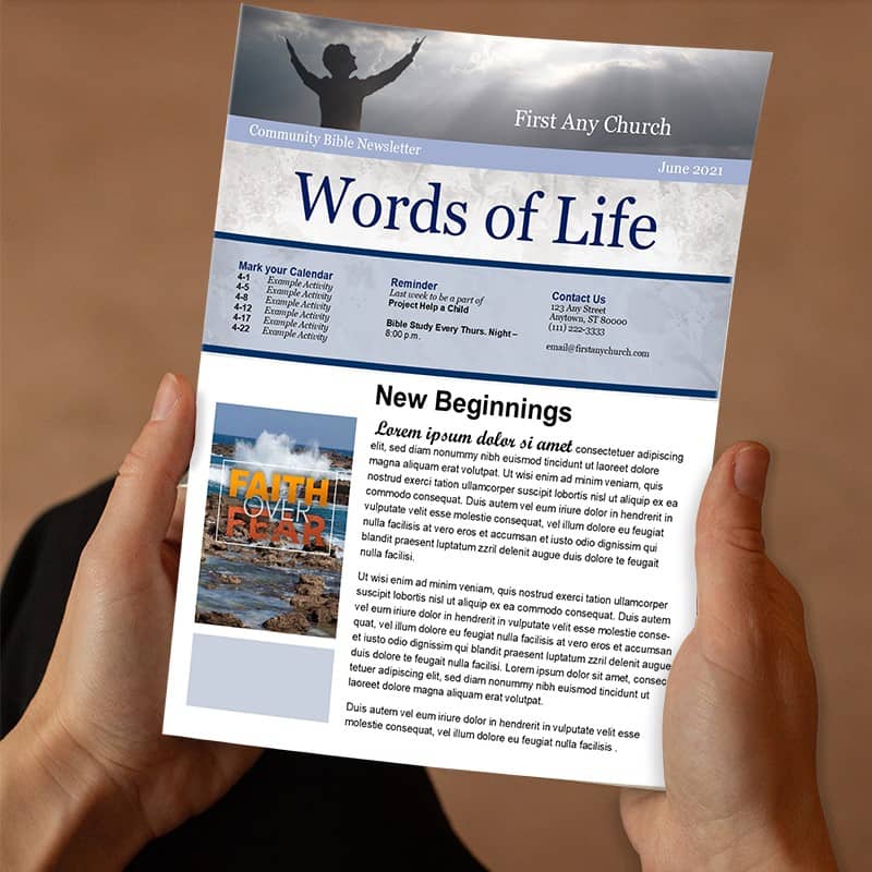
A handwritten font is ideal for making small notes or callouts within an article. Or try it in the margins of your church newsletter. Either way, it’s bound to catch people’s attention.
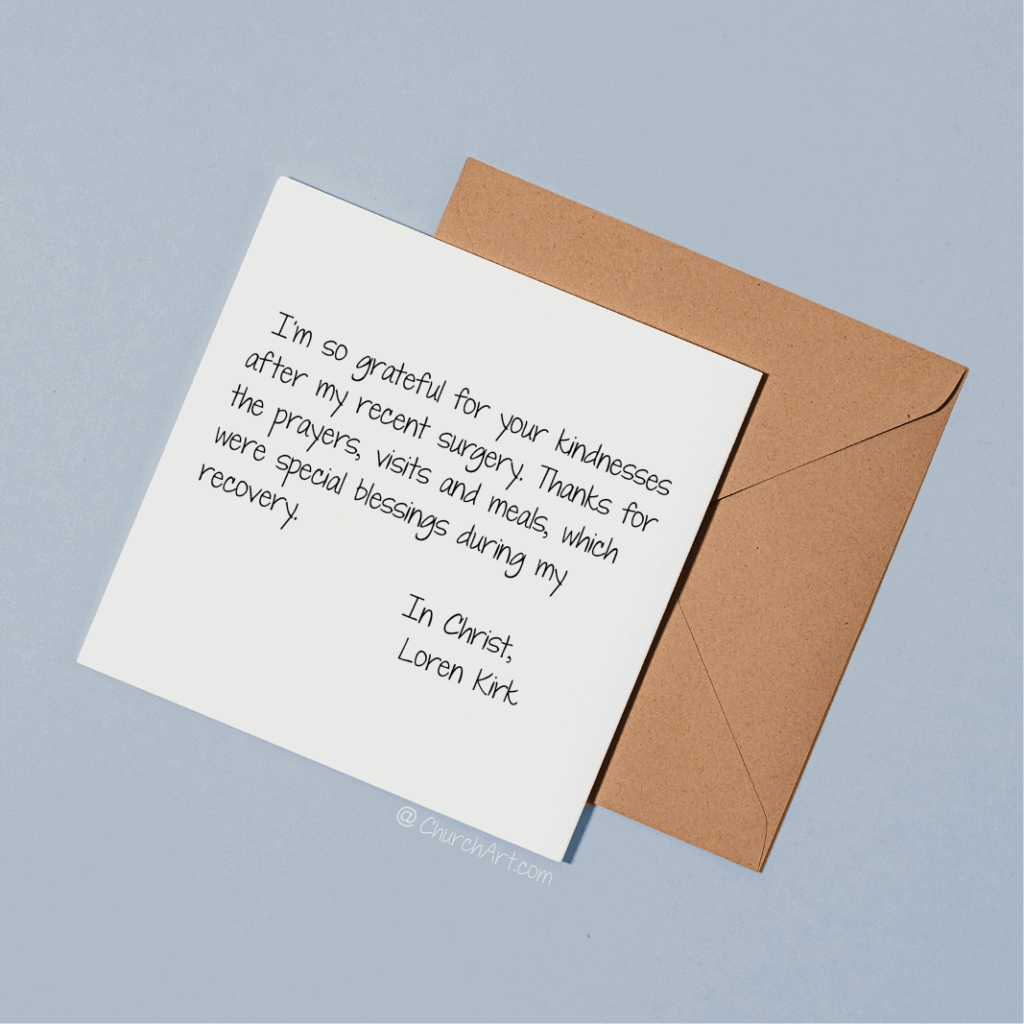
Handwriting fonts are also great for reproducing short letters, such as a thank-you note from a church member or for a pastor’s letter. Choose a font that looks like it could be actual handwriting, and use a color, such as blue, to enhance the look. Avoid using handwritten fonts for large amounts of text.
Use an initial cap styles
An initial cap is a typography treatment many graphic designers use. While it is commonly called a drop cap, a drop cap is a subset of initial caps. Initial caps are single, oversized characters that are the first letter of a paragraph and are enlarged for decorative design purposes. They’re usually set in a different font from the rest of the paragraph.
Initial cap styles include drop caps, raised caps, adjacent caps, decorative caps and reverse caps. You can learn more about different initial cap styles in our blog article Start out strong with initial caps.
Other ways to combine different fonts
Vary the sizes of words to grab the attention of your congregation. You can also mix the fonts when creating an attention-grabber.
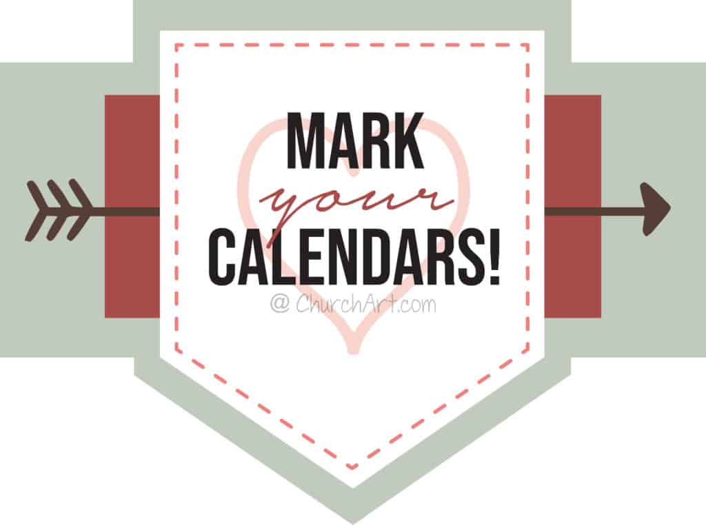
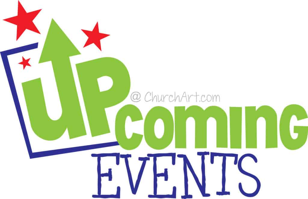
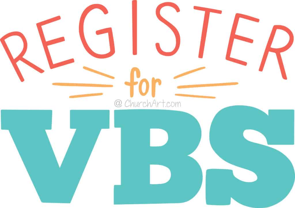
Varying the colors of words adds even more interest for readers.

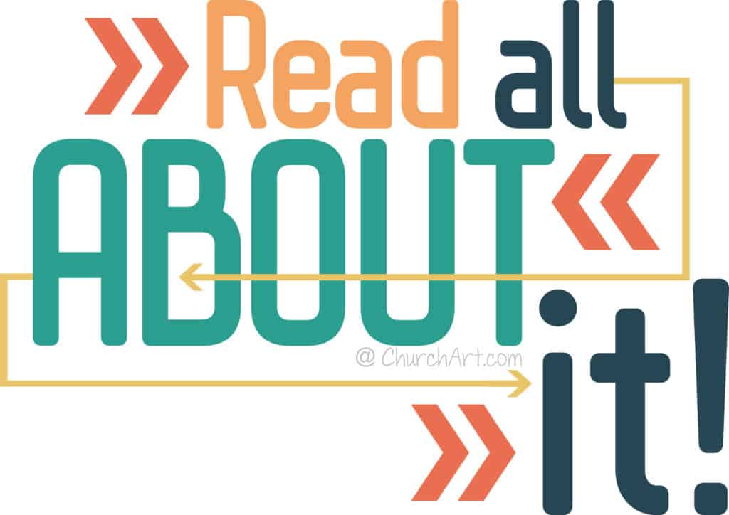

Your turn to be the graphic designer!
Now that you’ve seen some of the great options for mixing and pairing fonts, it’s time for you to try some of these ideas and techniques. Experiment with sizes, styles, weights, colors and capitalization. Play with these church newsletter ideas to see what you can create. And most of all: Have fun!
ChurchArt Team
We love art, are passionate about helping churches create professional-looking communications and are a fun bunch of folks. With an in-tune creative director and a rock-solid team of artists, we will provide the art you’ll want to use, plus templates, puzzles and extras that make your job easier.


