Learn The Proper Use Of Boxes, Screens And Rule Lines
We all like to box things in, or keep them separate from one another. Boxes, screens and rule lines can add visual balance to a page and help organize it.
But used too often, these “dividers” can clutter a page, confuse readers and even form barriers that unintentionally separate copy that belongs together.
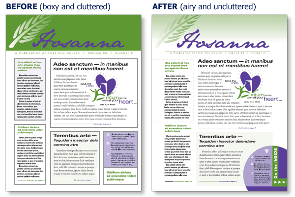
Below is a layout with too many boxes, as well as a makeover that shows how eliminating some of them restores balance on the page.

If you feel the need to box in an article for organization, try one of these ideas instead:
- Use a thin rule line above, below or beside the text instead of boxing it in all the way.
- Make headlines a bit bigger to help differentiate between articles.
- Add white space to air things out. You may need to cut or shorten a sentence or two, but the results will be worth it.
ChurchArt Team
We love art, are passionate about helping churches create professional-looking communications and are a fun bunch of folks. With an in-tune creative director and a rock-solid team of artists, we will provide the art you’ll want to use, plus templates, puzzles and extras that make your job easier.


