Best Fonts for Church Publications: Serif vs. Sans Serif and Where to Use Them
When it comes to designing effective and engaging church publications, one of the most important decisions you can make is which specific font to use. The right font sets the tone, enhances readability, and helps communicate your message clearly. You may have heard about serif and sans serif fonts—but what exactly are they, and which should you use in your church communications?
What’s the Difference Between Serif and Sans Serif Fonts?

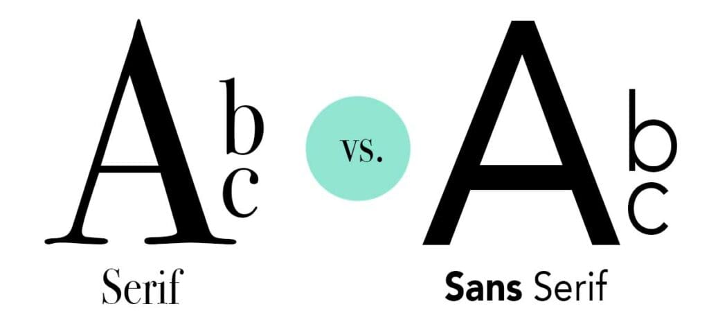
Let’s start with a basic definition. Serif fonts have small decorative lines or “hooks” (called serifs) at the ends of their letters. These small lines help guide the reader’s eye from one letter to the next, creating a smooth reading experience. Examples of common serif fonts include Times New Roman, Georgia, and Garamond.
Sans serif fonts, on the other hand, do not have these extra lines. “Sans” is a French word meaning “without,” so sans serif literally means “without serif.” Sans serif fonts have a clean, modern look and are often used in digital design. Popular sans serif fonts include Arial, Helvetica, and Calibri.
Why Font Choice Matters in Church Publications
Church bulletins, newsletters, flyers, and PowerPoint presentations all serve different purposes, but they share one common goal: clear communication. The fonts you choose can either help or hinder your audience’s ability to absorb your message.
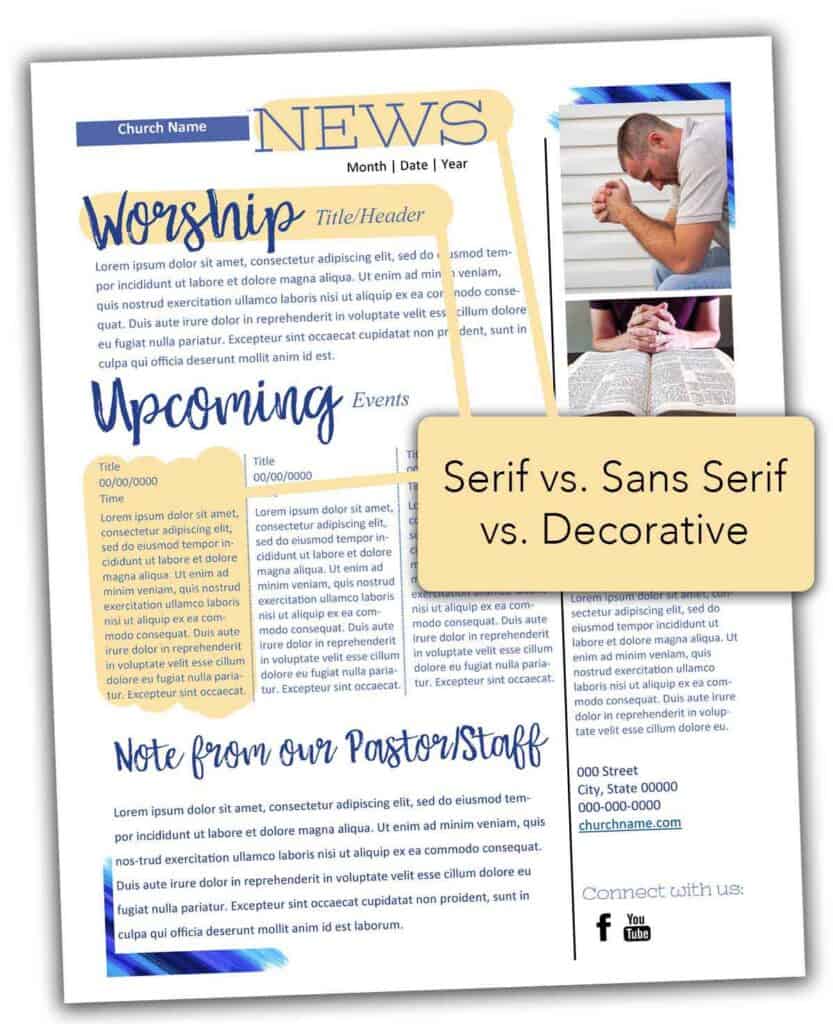
In print materials, such as bulletins or newsletters, a serif font is often preferred for body text because its decorative lines enhance readability over long passages. The flow of the text feels more natural to the eye, making it easier for church members of all ages to stay engaged with your content.
For digital materials like church websites, emails, or social media graphics, sans serif fonts are usually the better choice. Their simplicity and clarity make them easier to read on screens of all sizes—from phones to projectors.
Best Practices for Using Fonts in Church Materials
No matter what type of publication you’re creating, here are a few essential font tips to keep your content readable, professional, and visually appealing:

1. Use Serif Fonts for Body Text in Print
A serif font will work wonderfully in printed material such as church bulletins, devotionals, and brochures. They give a traditional, trustworthy appearance that’s ideal for more formal or long-form content such as a church newsletter. Garamond or Georgia are beautiful options that maintain readability while adding a touch of elegance.
2. Use Sans Serif Fonts for Headlines and Digital Screens
Sans serif fonts are ideal for headlines, subheadings, and captions. They are also best for PowerPoint slides, websites, and any materials that will be viewed on a screen. Fonts like Helvetica and Open Sans provide a clean, contemporary look and ensure text remains legible at smaller sizes.
3. Stick to Two or Three Fonts
Consistency is key. Using more than two or three fonts in one publication can make your design feel chaotic and unprofessional. Pairing a serif body font with a sans serif headline font creates visual contrast while maintaining harmony.
4. Be Consistent Across Publications
Church members tend to recognize and trust familiar layouts and styles. Keeping font usage consistent across all of your communications—from the weekly bulletin to your event flyers—helps build a cohesive visual identity for your church.
5. Check Readability at Different Sizes
A font that looks great in a headline might not be readable in a paragraph, especially for older readers. Be sure to test your fonts at various sizes and in different contexts to ensure clarity. Avoid overly decorative or script-style fonts for large blocks of text.
6. Match Your Fonts to the Tone of the Message
Fonts convey both emotion and style. A playful sans serif font might work great for a children’s ministry handout but feel out of place in a memorial service program. Consider the mood and purpose of your message before finalizing your font choices.
Font Pairing Ideas for Church Designers
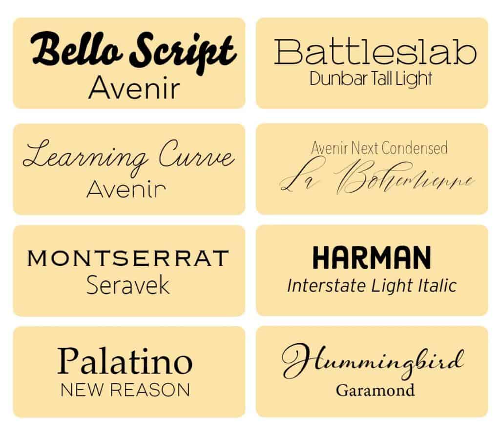
Here are a few great combinations that you can use for different types of church publications:
- Traditional Print Bulletin: Georgia (body) + Arial Bold (headlines)
- Modern Worship Guide: Merriweather (body) + Montserrat (headlines)
- Children’s Ministry Handout: Nunito (body) + Poppins (titles)
- Church Website: Lato or Roboto (body) + Oswald (titles)

Wrapping It Up: Font Choices with Purpose
Choosing the best fonts for your church publications is about more than just aesthetics—it’s about clear communication and creating a welcoming, professional presentation of your ministry. Serif fonts offer readability and tradition for print, while sans serif fonts provide clarity and simplicity for digital use.
By sticking to a few key principles—use fonts appropriate for the medium, limit the number of font styles, and keep your formatting consistent—you can create church publications that are not only beautiful but effective. Whether you’re preparing a Sunday bulletin, designing a sermon slide, or updating your church website, the right fonts can make all the difference.
Looking for an easier way to choose different fonts that look great together? ChurchArt Pro templates take the guesswork out of font pairing with professionally designed layouts you can use for bulletins, flyers, newsletters, and more. Whether you’re creating print or digital materials, these templates are designed to help you communicate clearly and beautifully.
Want more church communication tips? Check out our other blog posts on layout design, seasonal color palettes, and using visuals to enhance your message!!
ChurchArt Team
We love art, are passionate about helping churches create professional-looking communications and are a fun bunch of folks. With an in-tune creative director and a rock-solid team of artists, we will provide the art you’ll want to use, plus templates, puzzles and extras that make your job easier.


