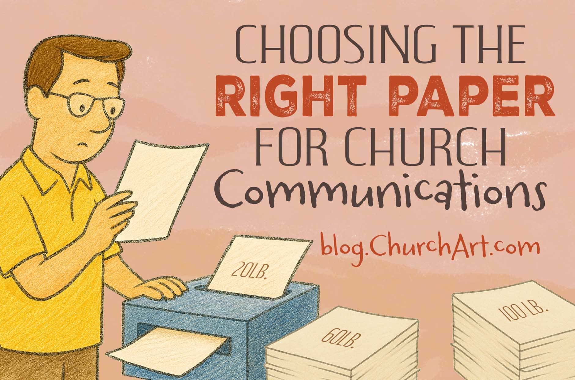
Choosing the Right Paper Stock for Church Communications
If you work in a church office or help design materials for the congregation, you probably have questions about choosing the right paper stock for church communications. Although general office stock is truly multi-purpose, it isn’t ideal for every use.
For example, photos don’t reproduce well on matte finishes or uncoated paper. This is especially true if you’re printing on both sides of the paper. Also, some occasions call for a thicker, higher-quality stock.
With any church communication, the first impression matters. And the right paper definitely makes your materials stand out. So let’s look at the characteristics of paper, options for common church print jobs, and ways to ensure that each final product has a high-quality look.
First Up: A Primer About Paper
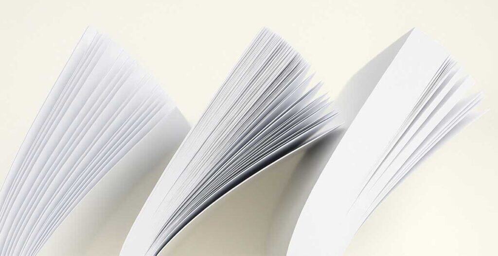
Paper stock differs by finish, opacity, brightness, color, and weight. Two different scales categorize paper weight. Standard office paper is rated as either “bond” or “offset” (sometimes called “book”).
For office purposes, these weight or thickness numbers are comparable but can be confusing. For example, 20-pound bond and 50-pound offset papers are almost identical; so are 24-pound bond and 60-pound offset. The number difference is due to the sheet size from which they are originally cut.
Most paper sold in office-supply stores uses the bond scale, but you may see paper rated using the interchangeable terms 20/50 or 24/60. Church newsletters, bulletins, and flyers work well on 24/60. Brochures are typically printed on 70- to 100-pound cover stock or text stock. For postcards and business cards, use 110-pound cover stock.
It can be difficult to find 60-pound paper at office-supply stores, but when compared to 50-pound paper, 60-pound is much less likely to jam in copy machines. Sixty-pound paper also results in less ink absorption, so ink cartridges last longer.
If you send projects to a print shop, the person in charge will explain paper stock choices. Experts can advise customers on appropriate paper thickness, whether for a promotional folded brochure or a congregational report with lots of photographs. They also can explain the time and money involved with each project, depending on the size of the print run.
When ordering special paper to do your own printing, request samples to ensure a top-notch finished product. Keep in mind that ink might flake off or not “set” on paper with even a slight texture. And ink can stay wet longer on stock with a glossy finish, or coated paper.
To learn more about paper stock for church use, let’s explore specific examples.
Church Communications: How to Choose the Right Paper Stock
Using paper other than general office stock is a good idea when you are: 1.) printing on both sides, 2.) printing in color and/or including photos, and 3.) wanting the finished piece to feel impactful in the hand.
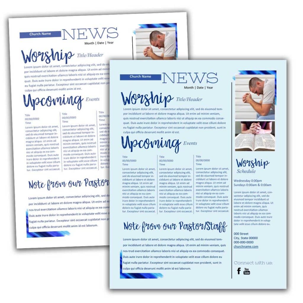
- Printing on both sides — With everyday paper, what’s printed on one side shows through the other. That’s because it has too little opacity (or too much transparency) for double-sided pages. A church newsletter almost always involves dual-side printing, so other paper stock is best for readability.
Most 20-pound papers don’t have enough opacity for two-sided printing, but 24-pound papers usually do. Coating and other ingredients also make a difference. But unless you have a reason to choose coated paper, you can save money by using uncoated paper that is made for two-sided printing.
- Printing in color and/or including photos — Office stock doesn’t provide the best reproduction because finish is a factor. Glossy, coated paper “shines” by providing crisp reproduction. Images are sure to pop, for example, when you use glossy paper for photo-filled brochures or a flyer for a special day or event.
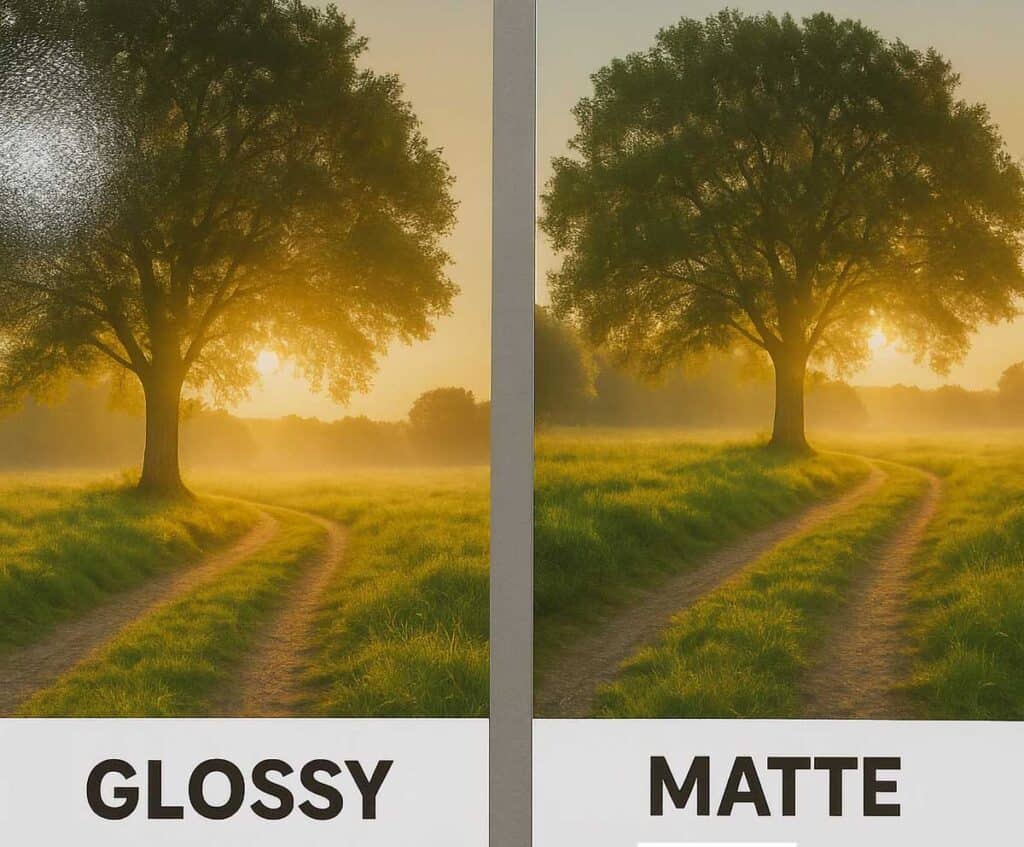
If photos and colored inks aren’t a priority, better-quality uncoated paper will usually suffice. But for the best reproduction, use coated stock. One caveat: To use coated paper in an ink-jet printer, look for paper marked for that purpose. Otherwise, the ink might smear when you touch the printed page.
- Wanting the finished piece to feel impactful in the hand — Again, multi-use paper falls short. Imagine a wedding invitation printed on standard copy paper, for instance. Even official letters have greater punch when delivered on more substantial paper.
Finish, weight, brightness, and color all play a role. Finish can include woven or smooth texture, a linen-like surface, or textured line patterns. Heavier papers communicate substance. Brighter papers give higher contrast between the surface and what is printed on it, affecting readability. This also influences the perception of ink color. Paper color can convey an ambiance, such as antique white for a formal dinner announcement.
With paper cost, a good rule of thumb is to start with light, white, and uncoated. Lightweight paper is less expensive than heavier paper. White paper is less expensive than colored paper. Uncoated paper is less expensive than coated paper. Smooth paper is less expensive than textured paper.
Always balance cost with the purpose of the printed piece. When something beyond light, white, and uncoated is necessary, many papers are available to meet your needs. Use all these tips and topics to choose the right paper stock for church communications.
Paper stock is more than a backdrop—it’s part of your message. The right choice enhances color, readability and the overall impression your materials make. Try experimenting with a few different finishes and weights. You’ll quickly discover how the right paper helps your church’s print pieces look more polished and inviting.
Stephanie Martin
Stephanie Martin is a senior editor at Communication Resources, producing monthly issues of The Newsletter Newsletter and ChurchArt Online. For more than three decades, she has written and edited materials for Christian congregations and ministry leaders. At her Denver-area church, Stephanie has volunteered in a variety of areas, from Sunday school and VBS to finances and administration.
Share This Post:
All the church-specific art you need IN ONE PLACE.

