Solve Common Newsletter Problems in a Snap
Looking for ways to improve your church newsletter and maximize its impact? You’d be surprised at how making some minor visual fixes can lead to major improvements for readers.
The quality of most church publications is quite impressive, especially considering that many church staff members and editors lack a design background. But based on the print and email newsletter samples we receive, several problem areas crop up repeatedly. The good news? These common church newsletter problems are surprisingly easy to correct.
So in the spirit of ongoing improvement, here are 6 tips to solve common newsletter problems. By using these suggestions, you’ll help church leadership communicate more effectively. Plus, the congregation and community will better engage with your newsletter issues and content.
Which of these church newsletter ideas can you apply to your own printed newsletter or email newsletters?
6 Solutions to Common Newsletter Problems
1. Too many boxes
In some church newsletters, almost everything has a box around it. Boxing an item can make it stand out and call attention to it. But if everything is boxed, the benefit disappears. When everything stands out, nothing stands out!
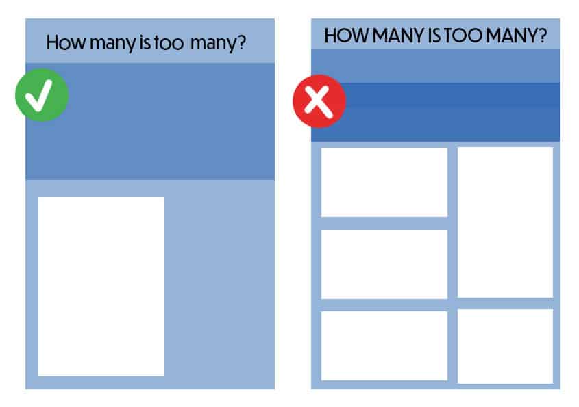
Boxing also eliminates any sense of narrative flow by chopping newsletter content into separate segments. You can improve most pages and layouts by reserving boxes for selected items.
Rather than trying to make a one- or two-sentence announcement stand out by boxing it, group several shorter announcements together. You can title that section “Short Takes” or “Bits and Pieces.” For a section featuring news from various church leaders, the header can be “Ministry Leader Updates.” The church community will appreciate this information being compiled in one handy place.
In most software programs, you can still draw a box and style the article to justify the lines. Simply select “no color” for the lines around the article.
2. Packed pages
Saving paper by fitting everything onto a few pages may be good for the church budget. But it’s distracting for newsletter readers. When copy crams every nook and cranny of a layout, people find it challenging to focus on — and finish — an article.
If your monthly or weekly newsletter has too much news for its space, you can add pages or increase their size (or both). Doing so allows room for the separation of paragraphs, bold print for headings, more than one column, and wider margins.
Increasing the space also means the text can be larger. Small print is difficult to read, especially for congregants with visual challenges. Another option is to place (or continue) articles on the church website. Just make sure those related posts aren’t packed to the gills either.
3. Font overload
Visiting an ice cream store with dozens of choices is exciting and stimulating. But at the counter, you generally order only one or two flavors. Think of church communication the same way. Variety is the spice of life, but like everything else, it can be overdone.
When newsletters use too many font styles and sizes, a “crazy quilt” of words and paragraphs can result. The many changes in type are usually distracting rather than enhancing. If text tends to focus readers’ attention on font styles instead of on the meaning and message, too much font variety exists.
4. Too much bold (or italics or all-caps)
Most of us have seen movies where an official gets on the horn and shouts, “NOW HEAR THIS!” That’s what bold type does. It says, “Hear this, see this, this is important!”
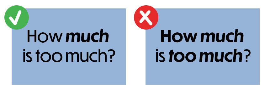
Use bold type (sparingly) to announce church events that are more than routine news. When bold type is overused, it loses its ability to emphasize. The same thing applies to the use of italics and all capital letters, which are difficult to read in large amounts.
5. Show-through
When newsletters and bulletins are printed on paper that’s too thin, the print and graphics from one side of a page are visible through the other side. This makes reading extremely difficult. The pages look dirty, which distracts readers. Plus, it gives people a poor impression of the publication — and possibly the church. The quick fix for this common newsletter problem is to use paper that’s heavy enough to avoid show-through.
6. Unrecognizable photos
Pictures of congregation members and volunteers in action are a highlight of newsletters. Unfortunately, many photos that portray church life are of poor quality. They’re dark, fuzzy, or so small that faces of clergy and congregants aren’t recognizable.
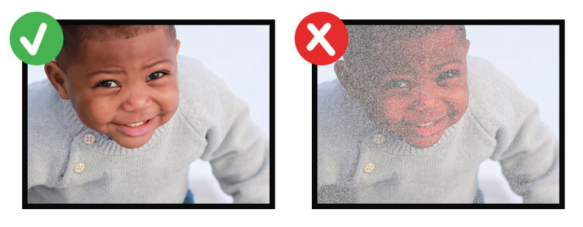
If you’re going to use photos — which we highly recommend — strive for high-quality images. And remember to use explanatory captions!
Taking the time to improve your church print and digital newsletter yields important dividends. Because the publications serve as ambassadors for your congregation, make sure they’re of high quality.
In addition to keeping people on your email list informed, the church newsletter is an outlet for spiritual encouragement and missions. Plus, it can spur increased church attendance, participation, and church growth.
Your church newsletter does a lot for your church. So, solve common newsletter problems that might be unnecessarily standing in the way!
ChurchArt Team
We love art, are passionate about helping churches create professional-looking communications and are a fun bunch of folks. With an in-tune creative director and a rock-solid team of artists, we will provide the art you’ll want to use, plus templates, puzzles and extras that make your job easier.
Share This Post:
All the church-specific art you need IN ONE PLACE.