Bring the Joy of Summer to Your Church Materials with a Fresh Color Palette
As summer arrives, many churches embrace a lighter, more joyful tone—both in spirit and in the materials they share. From bulletins and flyers to social media and slides, the colors you choose help convey your church’s message clearly and beautifully.
Just like the seasons change, so should the colors we use in our church communications. Color choices aren’t just about looking good—they affect how people feel. They can increase clarity, enhance visual appeal, and help set the right tone for everything from worship to outreach.
In this article, we’ll share easy-to-follow guidance for choosing and applying a summer palette that works for your church.
Why Seasonal Colors Matter in Church Communication
Color is one of the first things people notice. It shapes how your materials are perceived and even how they’re remembered. Seasonal colors not only help you stay visually relevant, but they also make your materials more engaging and inviting.
Summer is all about warmth, energy, and celebration. When your church’s materials reflect that, they can help create a sense of connection and excitement. A well-chosen palette sets a tone of welcome and celebration that matches the summer season’s events—Vacation Bible School, baptisms, outdoor worship services, and community picnics.
What Makes a Color Palette “Summery”?
Summer colors tend to be bright, cheerful, and a bit lighter than other seasons. Think sky blues, sunshine yellows, grassy greens, coral pinks, and soft oranges. These colors echo nature during the warmer months and help evoke feelings of joy, lightness, and fun.
Keep in mind that a summer palette doesn’t need to be loud. Pastels and soft hues can also work beautifully, especially if your church leans more traditional. The key is to find tones that feel both fresh and consistent with your church’s personality.
Color Palette Ideas for Summer
Need a little inspiration? Try these sample combinations:
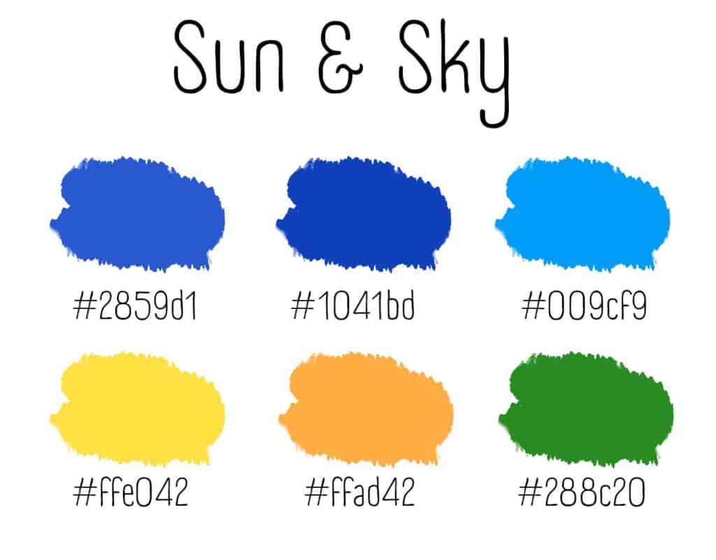
Sun & Sky – Lemon Yellow, Sky Blue, Grass Green
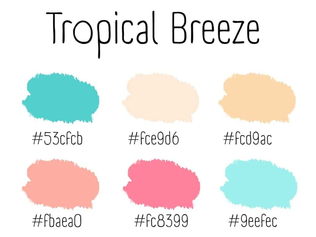
Tropical Breeze – Coral Pink, Aqua, Soft Sand
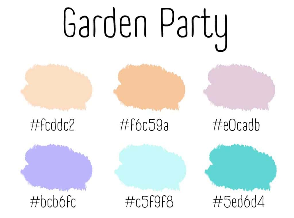
Garden Party – Lavender, Mint Green, Peach
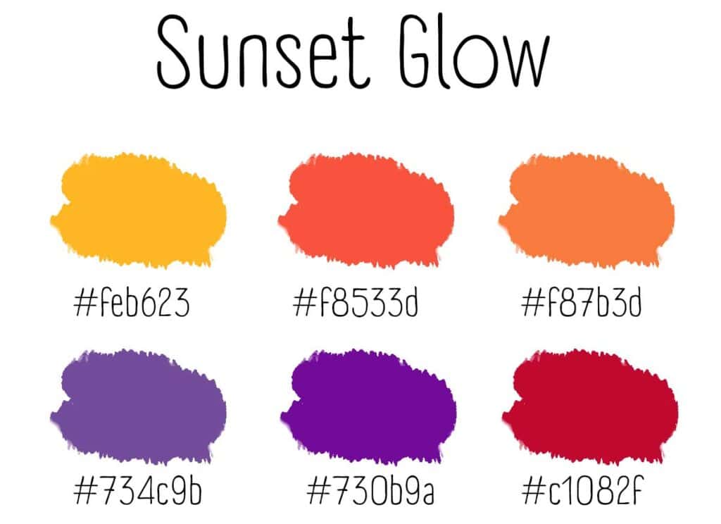
Sunset Glow – Tangerine, Plum, Goldenrod
Use 2–3 of these colors consistently in your materials. Pair bold hues with neutrals like white, light gray, or cream for balance.
Tips for Using Color in Church Newsletters
- Highlight Key Information: Use a bold or bright color to draw attention to important dates, calls to action, or headings.
- Stay Consistent: Choose one palette and stick with it throughout the season. This helps reinforce your brand and makes each piece feel connected.
- Balance Color with White Space: Too much color can be overwhelming. Let your designs breathe with plenty of clean space.
- Use Color Intentionally: Think about the emotion each color conveys. For example, use yellow for joy, green for growth, or blue for peace.
With just a few thoughtful color choices, your summer materials can feel fresh, fun, and aligned with the joyful energy of the season. Whether you’re planning bulletins, flyers, or digital graphics, summer is the perfect time to brighten things up.
✨ Ready to get started? Browse our ChurchArt Online library for thousands of seasonal images and designs—or try one of our ready-to-use templates you can customize in Canva!
ChurchArt Team
We love art, are passionate about helping churches create professional-looking communications and are a fun bunch of folks. With an in-tune creative director and a rock-solid team of artists, we will provide the art you’ll want to use, plus templates, puzzles and extras that make your job easier.
Share This Post:
All the church-specific art you need IN ONE PLACE.