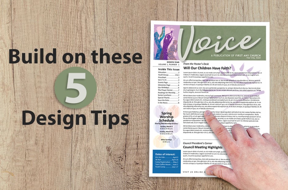
5 Design Ideas for Better Church Newsletters
“There is no such thing as no design,” writes author Adam Judge. “The alternative to good design is always bad design.” That raises the question: How can church newsletter editors ensure that their publications avoid falling into the “bad design” category? The answer involves understanding the basic elements of any newsletter design — and then using those elements in eye-pleasing ways that attract readers.
As you ponder design ideas for better church newsletters, realize that source material literally surrounds you. Design occurs not only on the pages of printed and online information but also on everything from fabric patterns to flower petals.
Although millions of unique designs exist, they all use these five basic elements:
- Lines
- Shapes
- Mass
- Texture
- Color
By understanding these five design building blocks, you can create just about anything, whether for print or church website use. Effective communication involves knowing how to tweak each of the design elements according to the medium you’re using and the audience you’re trying to reach.
Your church newsletter, pastor column, weekly worship bulletin, social media post, congregation and committee reports, and prayer request lists will draw in readers — from the faithful churchgoer to the person beyond the parish — when you build on a solid foundation of design principles.
Let’s take a closer look at each of these design ideas for better church newsletters:
1. Lines
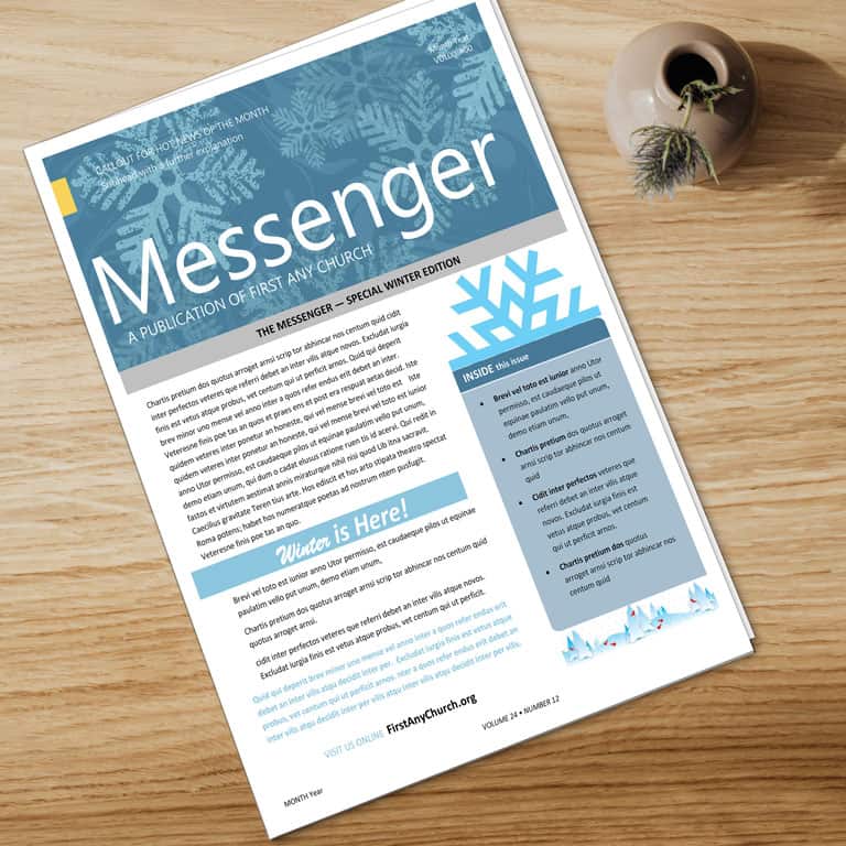
Yes, these are generally marks that connect two points. But lines don’t always have to connect via the shortest possible distance. They can be straight, curved, wiggly, wandering or jagged. They can be horizontal, vertical or diagonal. Lines can be thick, thin or varied. Often lines are solid, but they can be dashed or dotted. That technique works well when you want to indicate that readers should clip and save a newsletter item about an upcoming Bible study, fundraiser or other church event.
For church newsletter ideas, you can use lines alone, in pairs or groups, or in combination with other elements to direct viewers’ eyes. Lines help organize a publication page or spread, connect elements, separate material (text as well as artwork), create a sense of movement, define areas and even create textures.
If you use a newsletter template to create your church newsletter, you’ll notice it consists mostly of lines. These serve to guide the overall placement of the material you want to share with church members.
2. Shapes
Shapes guide the eyes of your readers, bring organization to a newsletter page, and convey emotion or commonly understood meanings. The three basic types of shapes are geometric, natural and abstract.
- Geometric shapes include rectangles, circles, triangles, octagons, cones and more.
- Natural shapes are found in or suggested by nature, such as leaves, fruit and even spills.
- Abstract shapes are stylized or simplified forms of natural shapes. These include shapes and icons often found on signs.
Geometric shapes, such as squares and rectangles, are so common and familiar that they convey reliability, stability and honesty. Yet they also can communicate rigidity. Used to box material, these shapes help organize a layout. (Think of a Facebook wall or timeline, with all the boxed-in posts.)
Circles grab attention because they’re used less often than rectangles. They imply infinity, inclusion and protectiveness. Triangles, which often convey a subconscious message of strength, work well as pointers or to suggest progression.
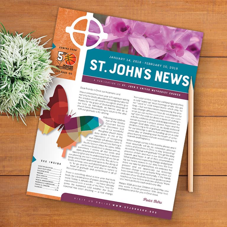
Natural shapes, such as starbursts and ink blobs, can imply spontaneity, the seasons, excitement and even the unexpected. Use these shapes to grab readers’ attention, share breaking news and announcements, and alert church members and visitors to special events.
Abstract shapes communicate meanings symbolically, such as the easily grasped meaning of the wheelchair symbol that designates reserved parking. That is an example of how design can express an idea or theme even without words.
Even the shape of a page contributes to communication. Just look at how the varied shapes of greeting cards add to the impact of their message. Experiment with different shapes and page sizes for your weekly or monthly newsletter, printed worship bulletin and other materials from the pastor or church leaders.
3. Mass
As used in newsletter design, mass means size. It can refer to the size of an individual element, an element’s relationship to other objects on a page, or an element’s size relative to the page size. The mass of a print or online piece contributes to its message.
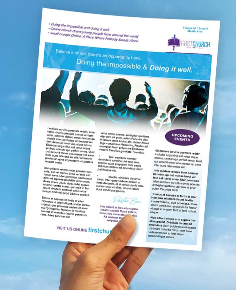
A piece of clip-art that measures 2″ x 3″ can seem small or large, depending on the page’s other objects and the size of the page itself. An image or photo can be run so large that it dominates a page, which, for some applications, may be desirable. An image that’s larger than other elements gives the page a focal point.
Mass also can refer to the size of the whole piece, including the page dimensions, the weight of the paper and the fold scheme. For example, when attending a funeral, suppose you see two stacks of bulletins containing the order of service. They’re identical except one bulletin is printed on thin copy paper and the other on a heavier-weight paper. Which would best convey to a reader the occasion’s “weightiness” and somberness?
Likewise, a church volunteer brochure that’s folded several times feels hefty in the hand and sends a different message than a piece that’s folded just once. So take time to consider what first impression each design will make when it reaches the people on your mailing list.
4. Texture
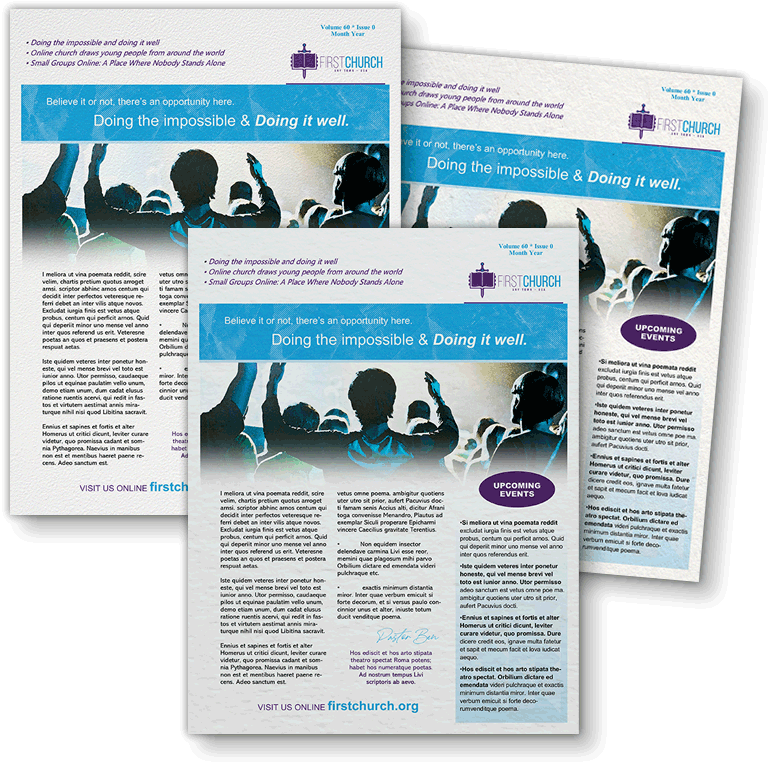
Texture is what the surface of a page feels like to the touch or to the imagination. That is, a church newsletter page or church bulletin can have either a tactile or a visual surface characteristic, or both. For example, a page can have a parchment feel because it’s printed on actual parchment paper, or it can look like parchment because a background is imprinted on the page. Thus, even website pages and PowerPoint worship slides can have a parchment “texture.”
With a printed piece designed for congregants, you can choose from papers with a host of finishes, including antique, embossed, linen, matte, vellum, woven and many others. But beyond the paper itself, you can use photographs, digitized images of actual textures (such as burlap or granite) or lines and shapes to create visual textures.
Each texture can increase the impact of your message. A church flyer with a visual burlap texture alerts readers that the subject deals with “country” or “plain living” even before they read the message about a harvest festival. An embossed invitation signals a high-class affair even before someone reads about the upcoming retirement dinner for a pastor or teacher.
5. Color
On some level, color is present in all designs, even those printed in black and white. The term refers to the lightness and darkness of parts of the page. But using more colors gives you added power to show contrast, lead the eye, impart a sense of movement and suggest a mood or theme.
When using a church newsletter template or a church bulletin template, you can change the colors and include seasonal design elements that appeal to the church community. For e-newsletter and emails, color tends to increase the open rate among members on the mailing list.
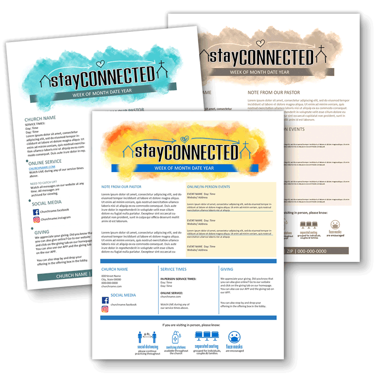
Colors fall into three general categories:
- Warm (red, yellow, orange)
- Cool (blue, green, violet)
- Neutral (beige, ivory, gray, black, white)
Each category of color affects people’s subconscious in a particular way. You can harness the power of color by choosing hues that best fit the purpose of each newsletter page or layout.
Warm colors stimulate energy and can evoke optimism, excitement and even anger. Because they appear to come forward, warm colors are active and attract attention. They’re effective for a call to action, a remembrance and a stirring appeal.
Cool colors have a calming effect because they are passive and appear to recede. Although they can make a publication seem cold or impersonal, when used correctly they are comforting and nurturing. Cool colors work well as backgrounds and in factual reports, serious articles and devotional pieces.
Neutral colors tone down the effects of surrounding colors. Used alone, they effectively add a touch of color when an emotional response isn’t necessary. Use neutral colors in administrative articles such as congregational reports and schedules.
As you plan and build each church publication, keep these five design ideas for better church newsletters in mind. Then consider how you can use them to construct print and web materials that have positive, “constructive” impacts on your readers.
ChurchArt Team
We love art, are passionate about helping churches create professional-looking communications and are a fun bunch of folks. With an in-tune creative director and a rock-solid team of artists, we will provide the art you’ll want to use, plus templates, puzzles and extras that make your job easier.


